PORTFOLIO CASE STUDY / 2026
A LEGACY,
PLAYED
FORWARD.
Extending an established family-led identity across California packaging, campaign design, lifestyle imagery, and dimensional retail concepts.
ROLE Packaging adaptation and production design, campaign design, lifestyle presentation, retail concepts, and 3D visualization.
ORIGINAL SYSTEM Brand identity and packaging preceded my involvement. The work shown here demonstrates stewardship and extension, not a rebrand.
THE BRIEF
AN ICONIC VOICE, A NEW STAGE.
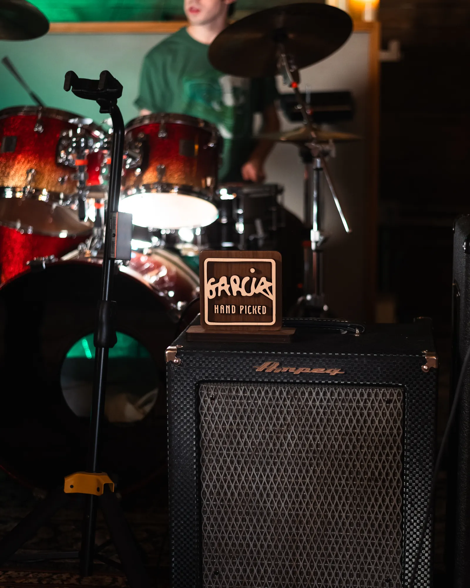
Garcia Hand Picked is bold, colorful, and easygoing. Psychedelic swirls, Jerry’s portrait, and playful lettering give the brand a familiar ’60s feel, while details like the guitar-pick handprint bring its musical roots into focus. Together, they create a welcoming personality that celebrates individuality and feels right at home alongside a favorite record.
Our role was to bring that personality to new markets and formats. We built on the brand’s recognizable colors, imagery, and typography, keeping each package, campaign, and retail display in tune with Garcia.
The work balanced that free-spirited style with clear product information and compliance with state labeling regulations.
LAS VEGAS / THRIVE DISPENSARY
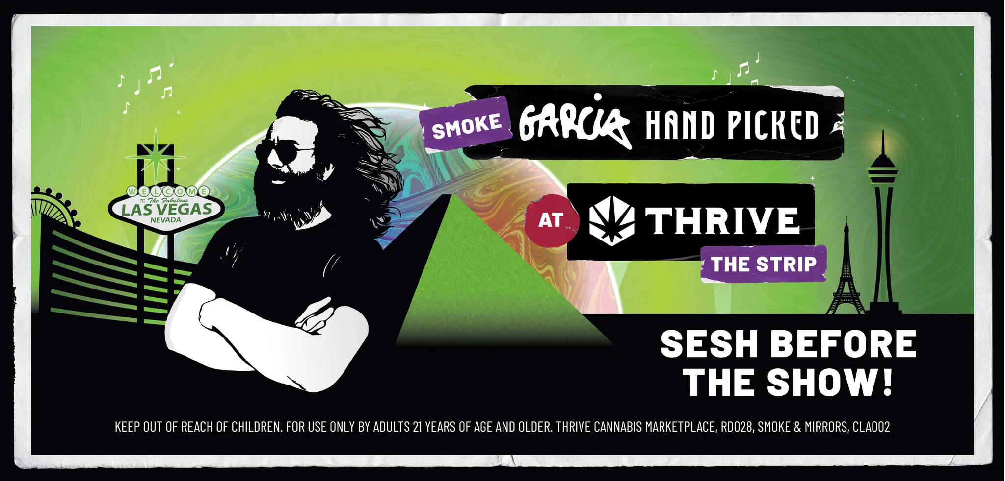
A VEGAS EXCLUSIVE.
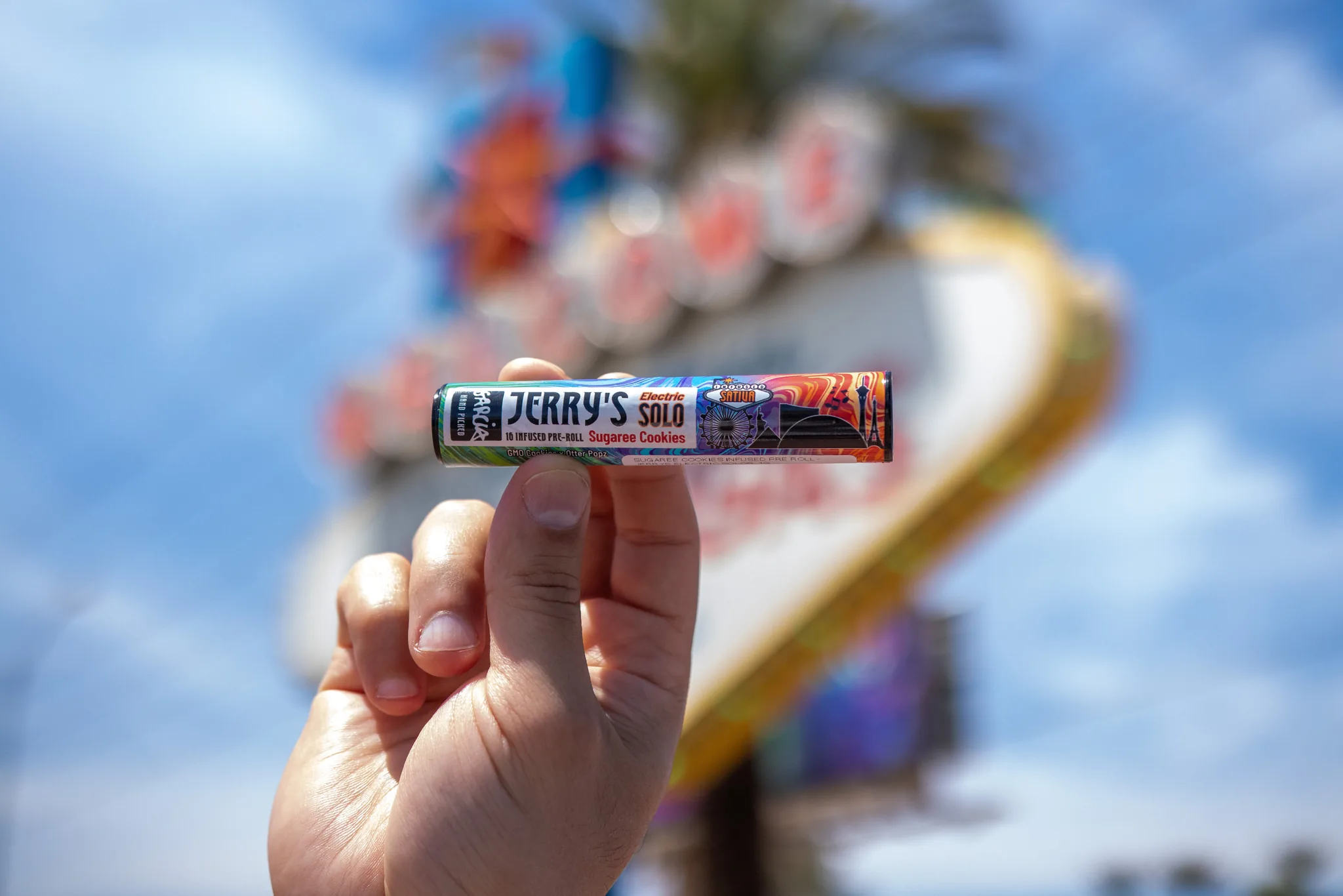
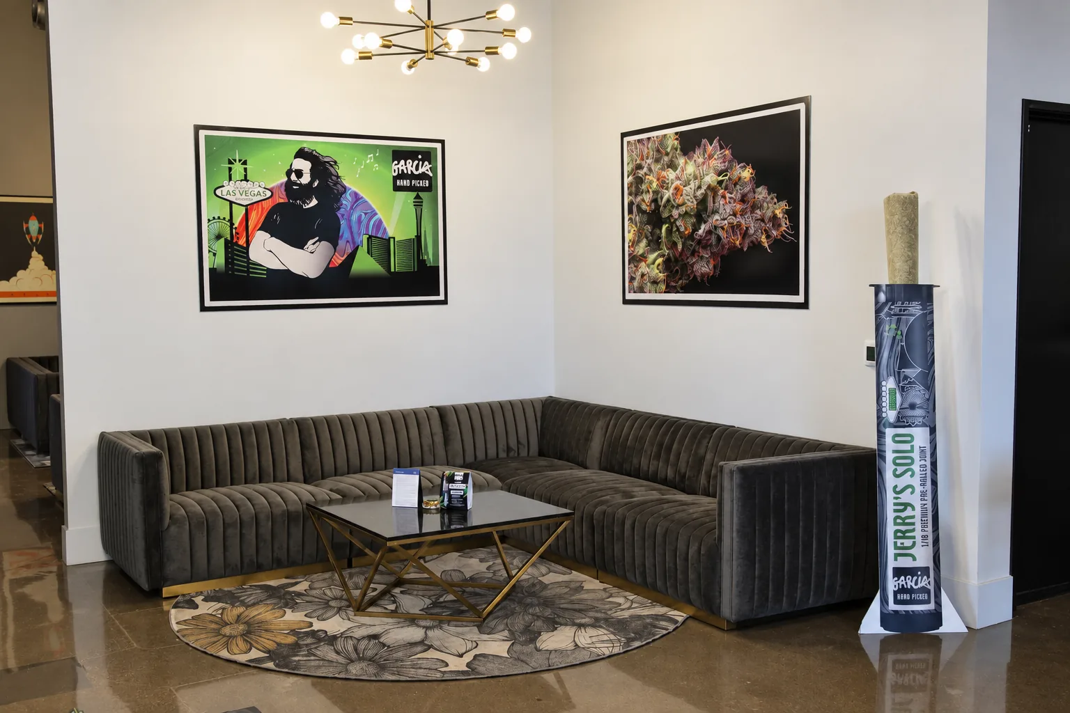
The LA campaign formed a separate creative chapter within the California work. For an exclusive event at Thrive Dispensary in Las Vegas, we created event-specific Garcia Hand Picked packaging. The design reimagines the Las Vegas skyline, with the Sphere depicted glowing with the brand’s signature marbling. We carried that visual concept into event key art and lounge graphics, connecting the packaging with the setting where it was experienced.
THRIVE
THE CALIFORNIA LAUNCH
BUILT FOR CALIFORNIA.
TRUE TO GARCIA.
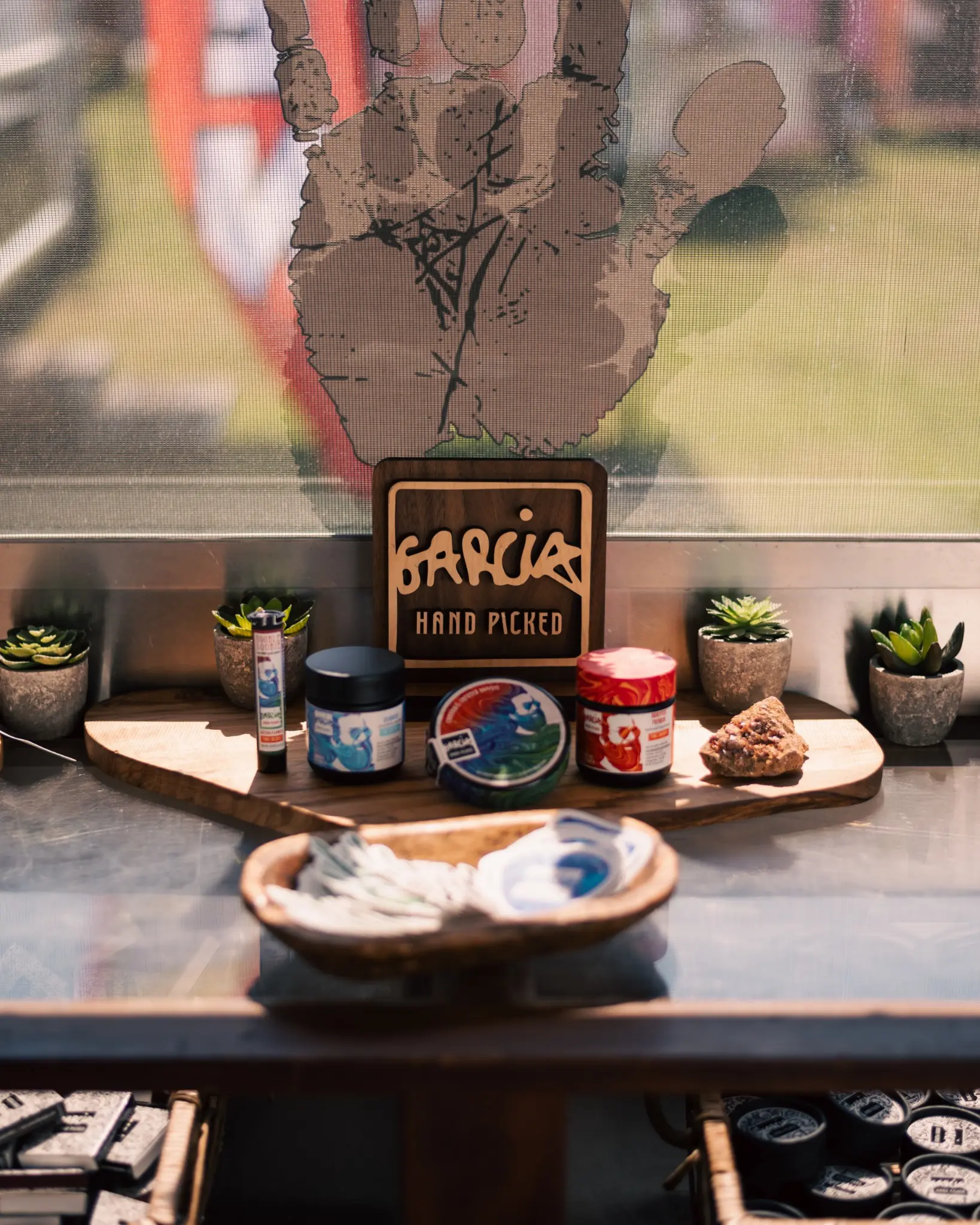
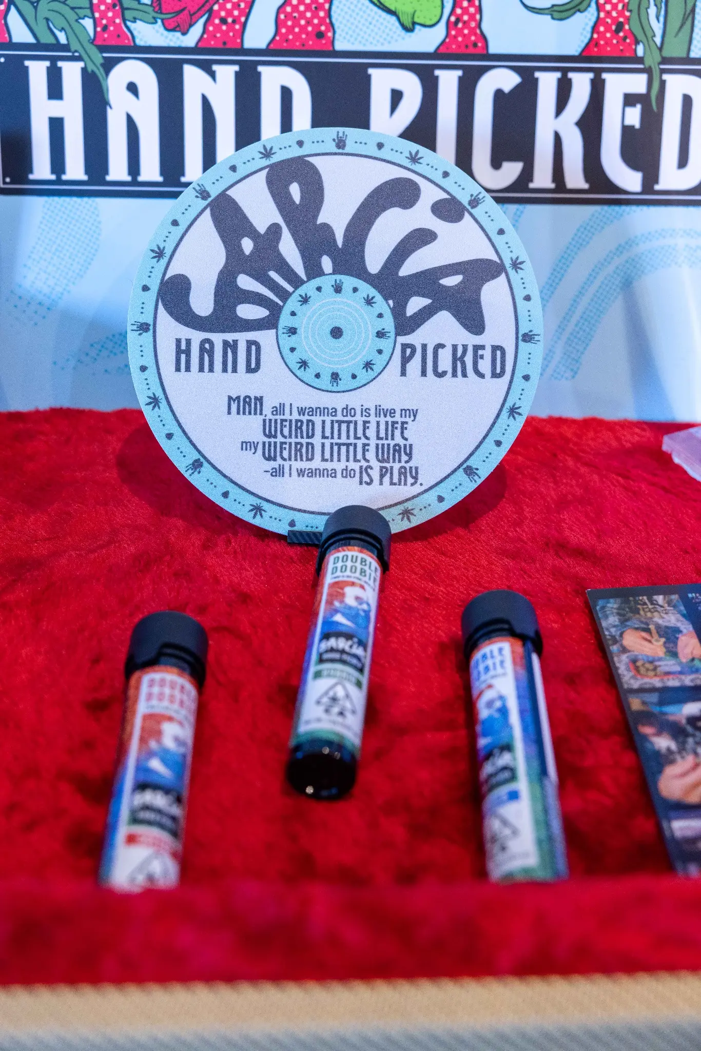
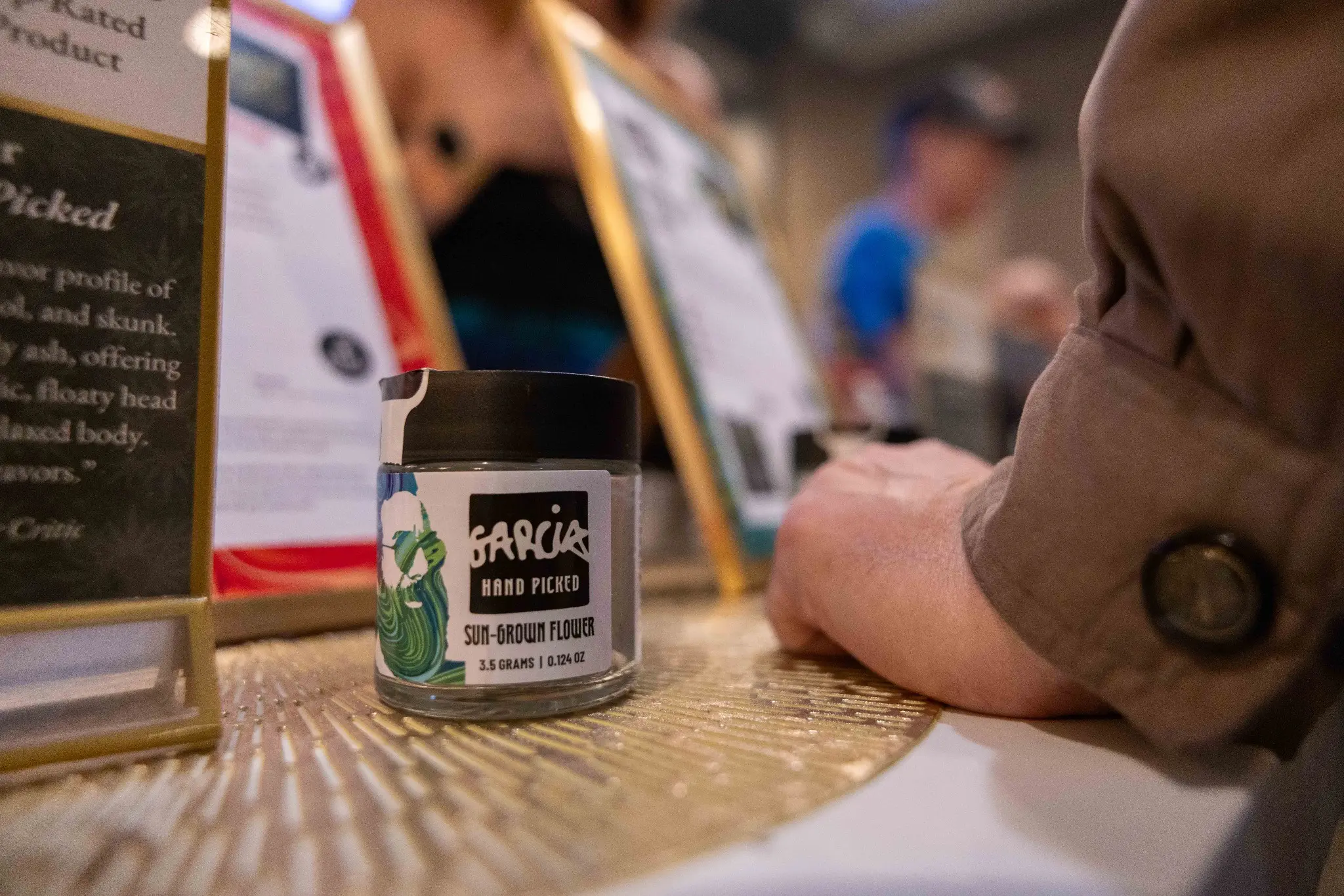
For Garcia Hand Picked’s California launch, we adapted pre-roll and flower jar packaging and developed marketing key art. We refined dielines, information hierarchy, compliance content, and SKU distinctions for California’s production and retail needs, carrying Garcia’s established colors, imagery, and typography across packaging and launch materials. The Garcia family approved the packaging, and Solful distributes the products.
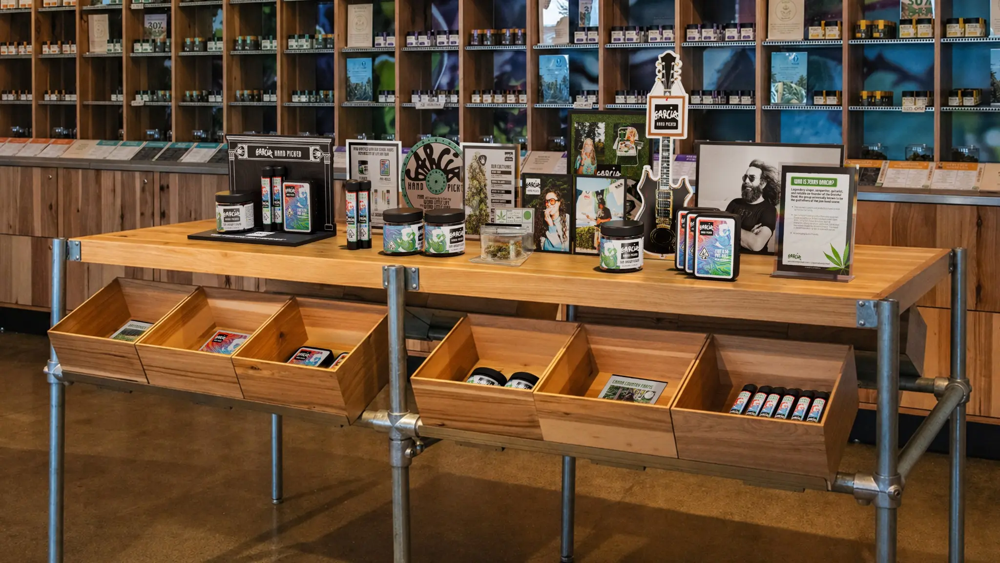
RETAIL DISPLAY CONCEPT
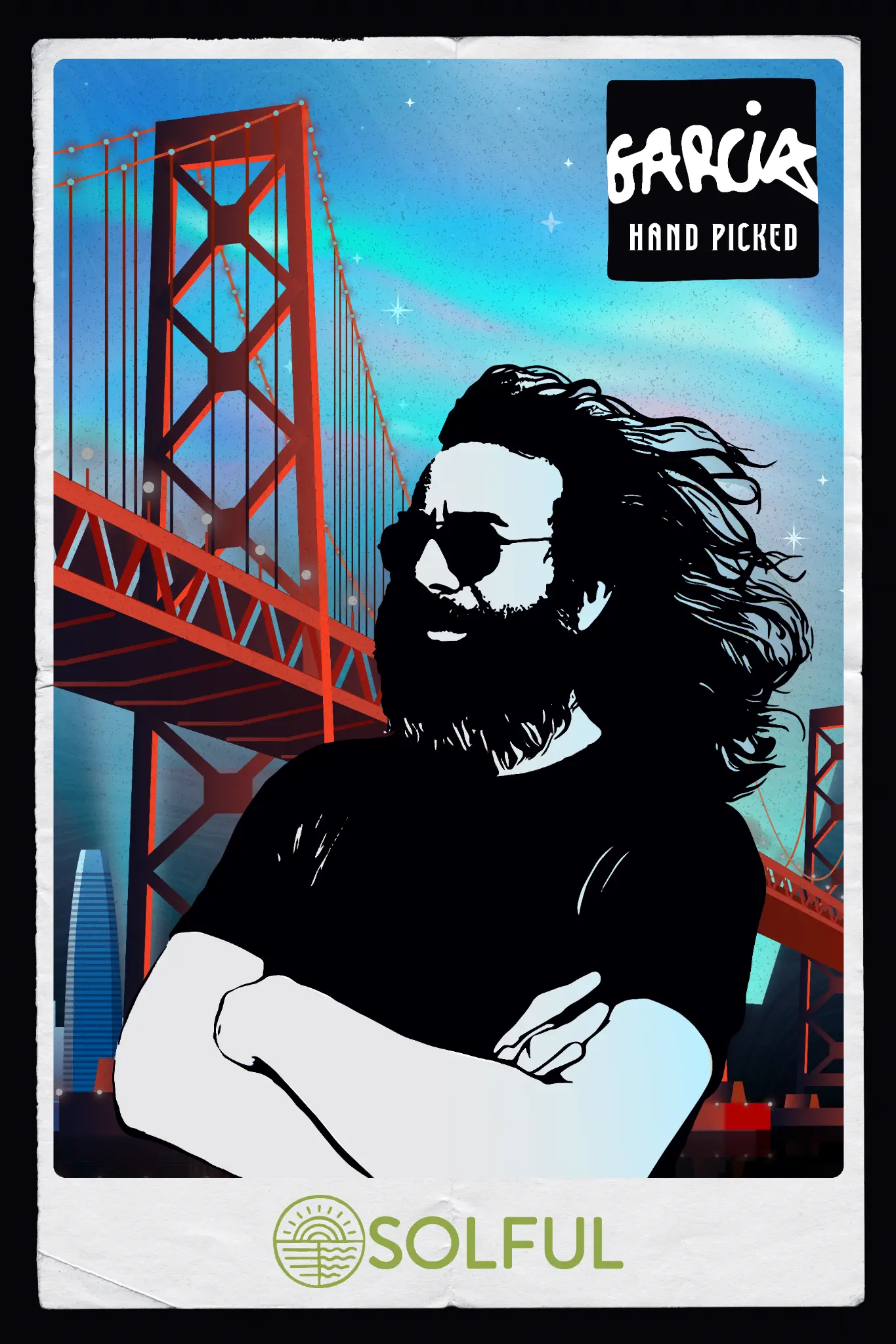
The California key art paired Garcia’s familiar imagery with a San Francisco setting. The retail concept shows how the launch materials could carry into a shared in-store environment.
ILLUSTRATION / MERCH / RETAIL
FROM SKETCH TO MAGIC.
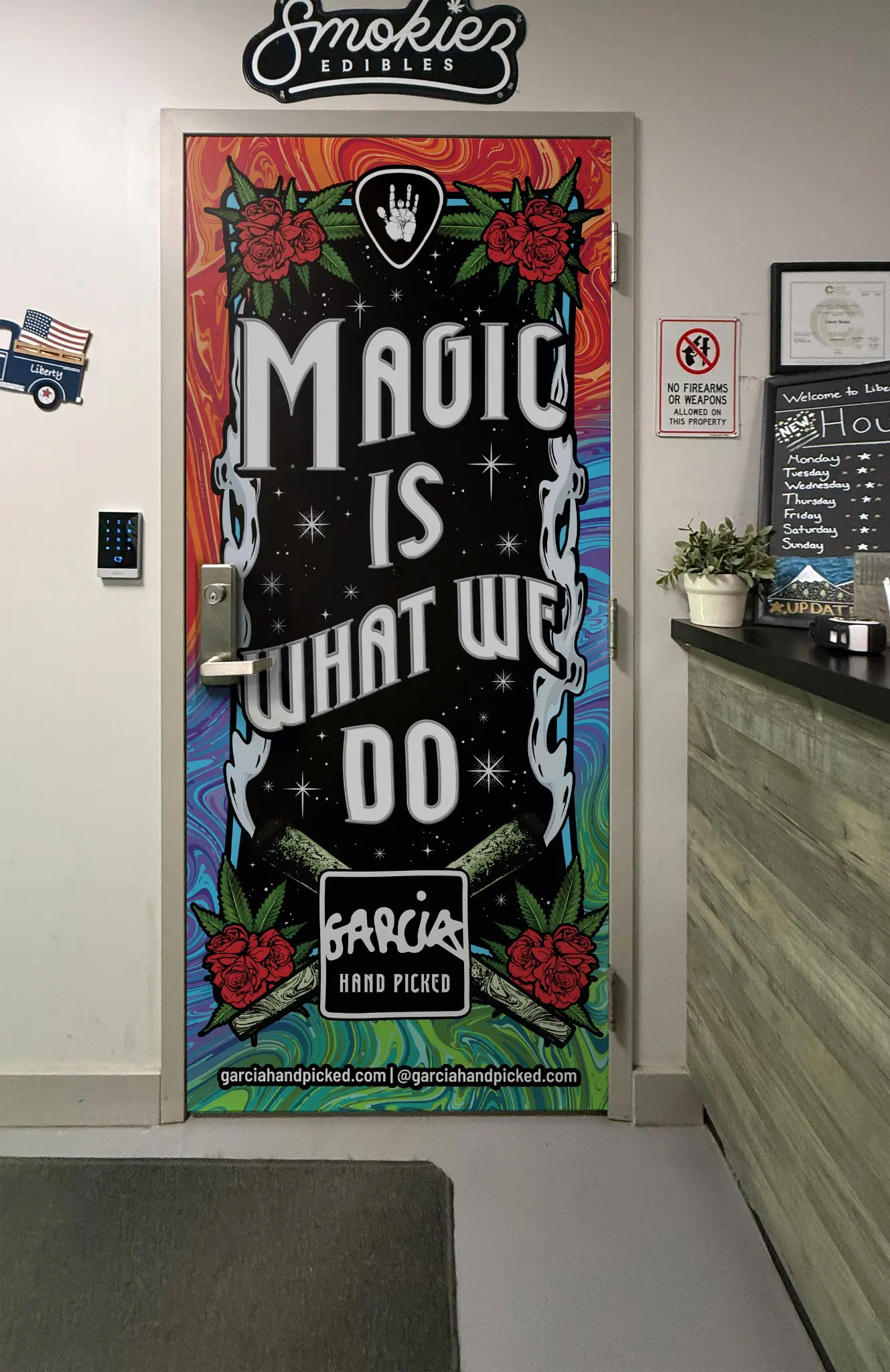
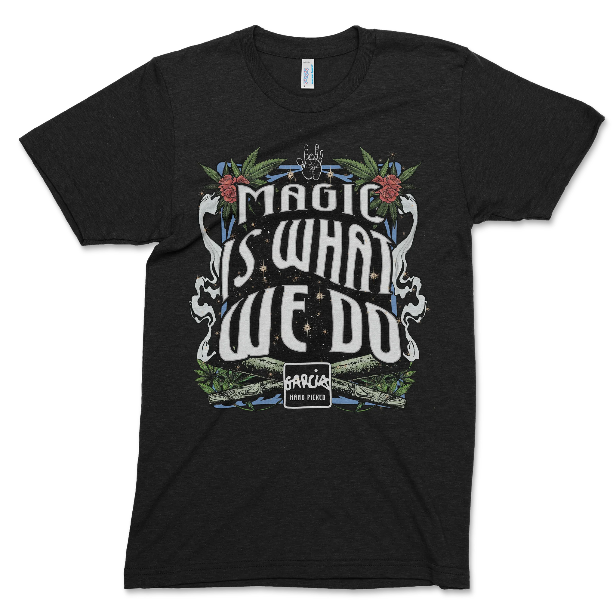
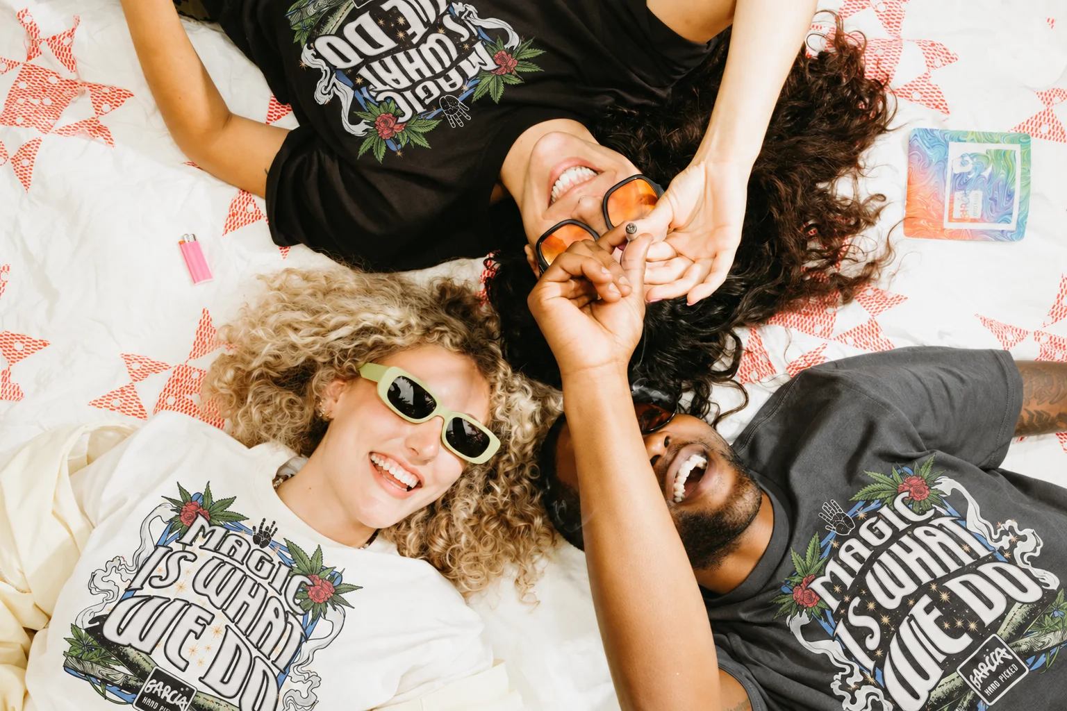
We created “Magic Is What We Do” as an illustrated world for Garcia Hand Picked, combining expressive lettering, roses, botanical forms, and the brand’s handprint. From drawn studies to finished artwork and motion, we carried the idea into apparel and retail graphics, giving the illustration a life beyond the page.
CONCEPT TO COUNTER
CONCEPTS YOU COULD WALK INTO.
Three-dimensional visualization made it possible to test scale, product density, sightlines, lighting, and brand hierarchy before production. The concepts range from portable activation pieces to dedicated shelf units and a broader multi-brand retail environment.
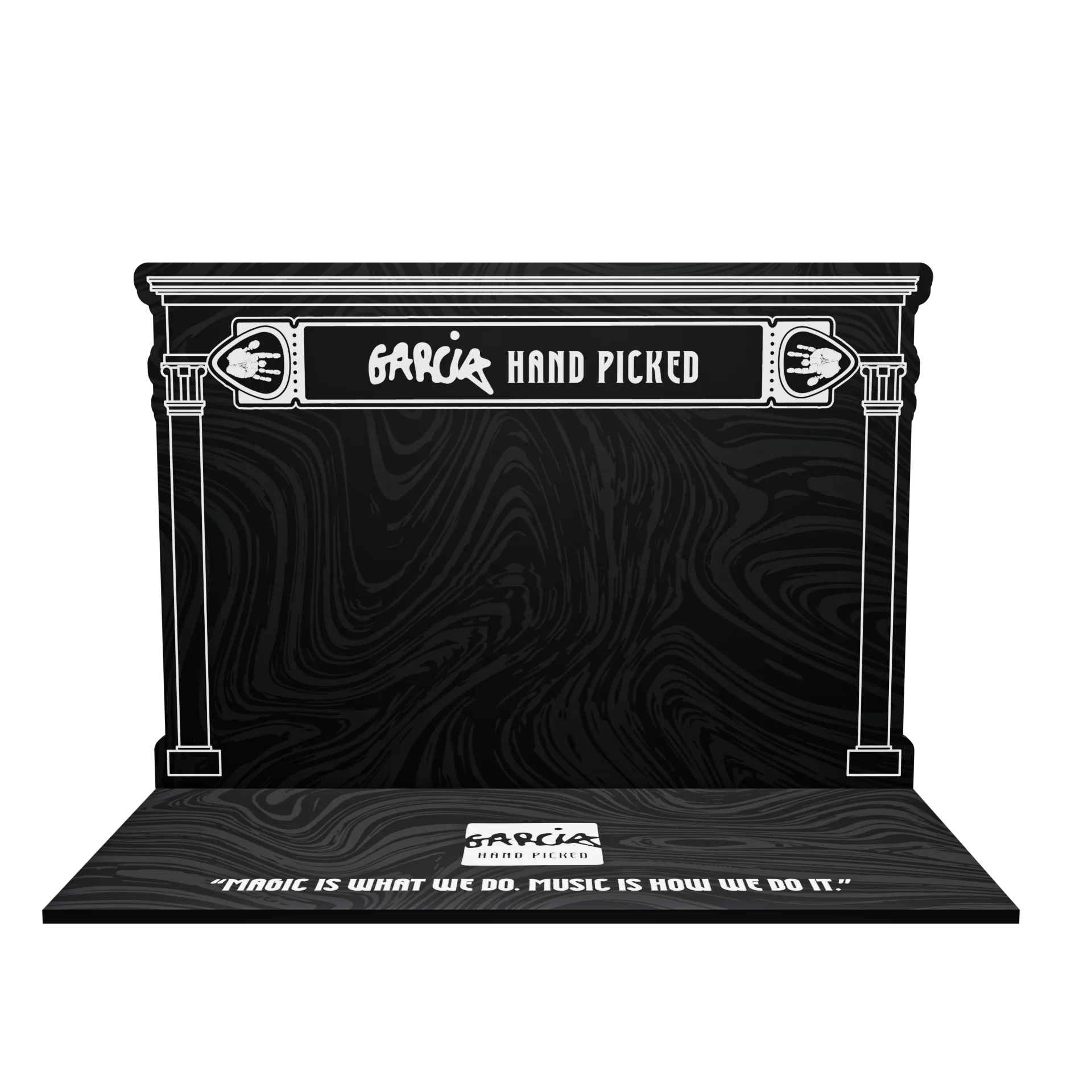
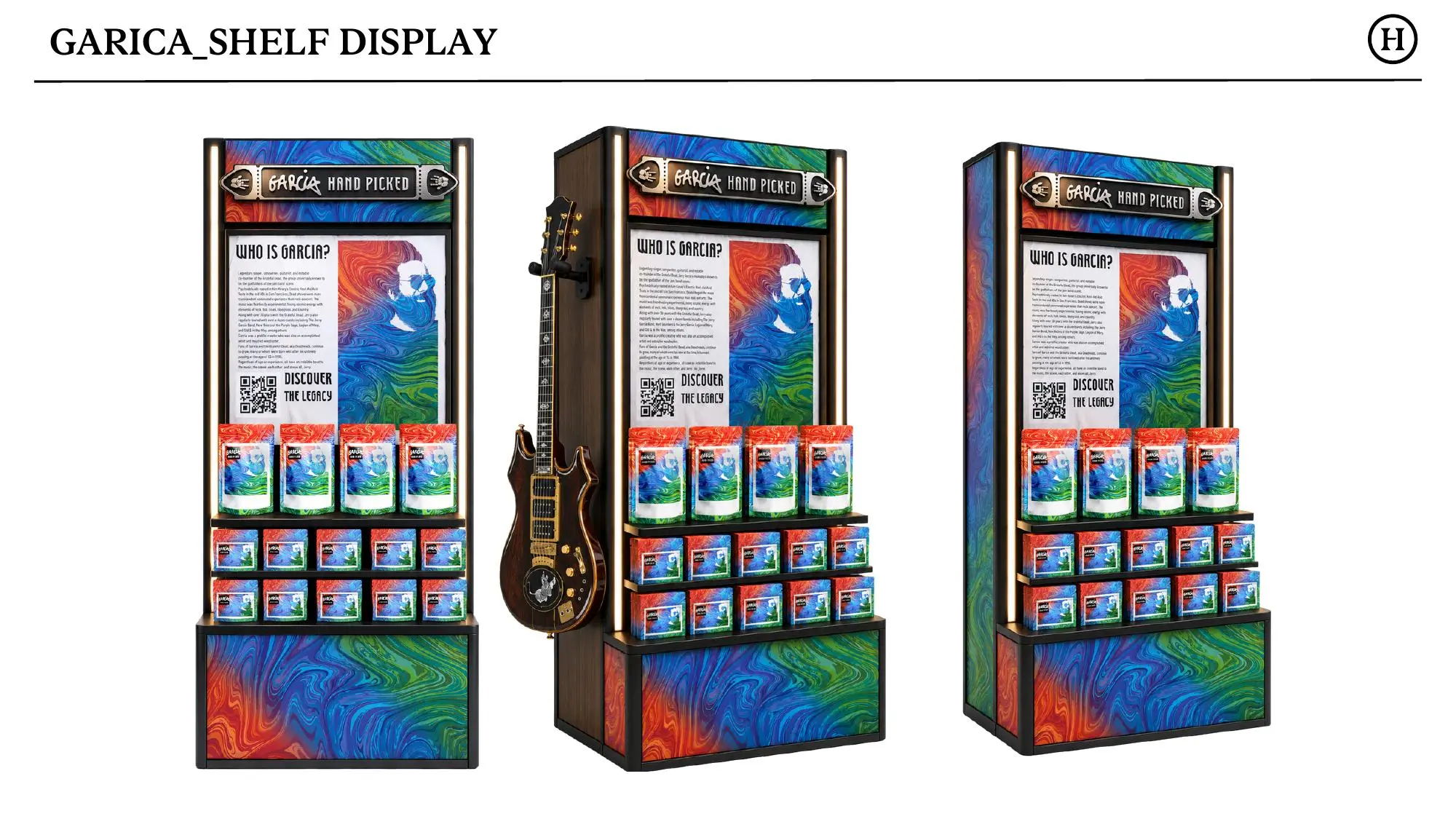
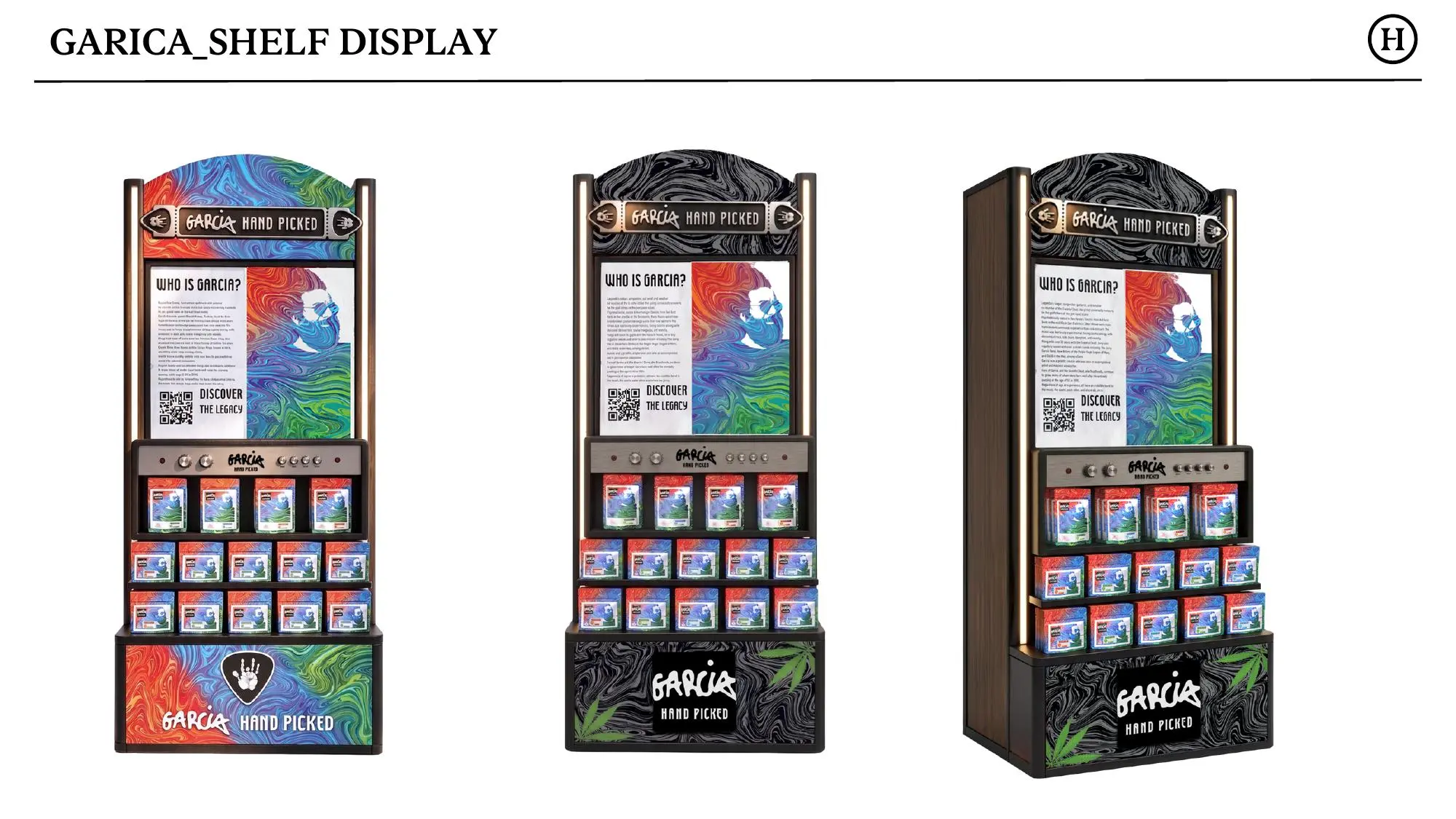
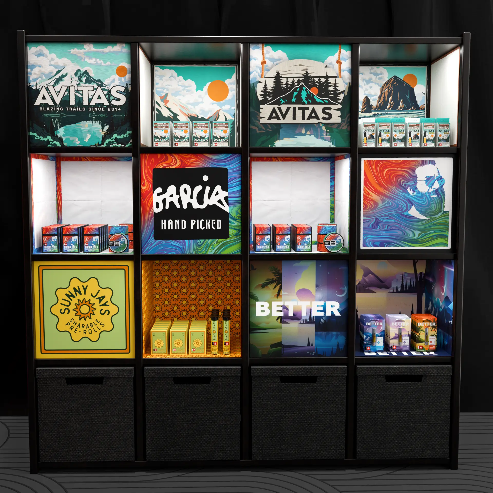
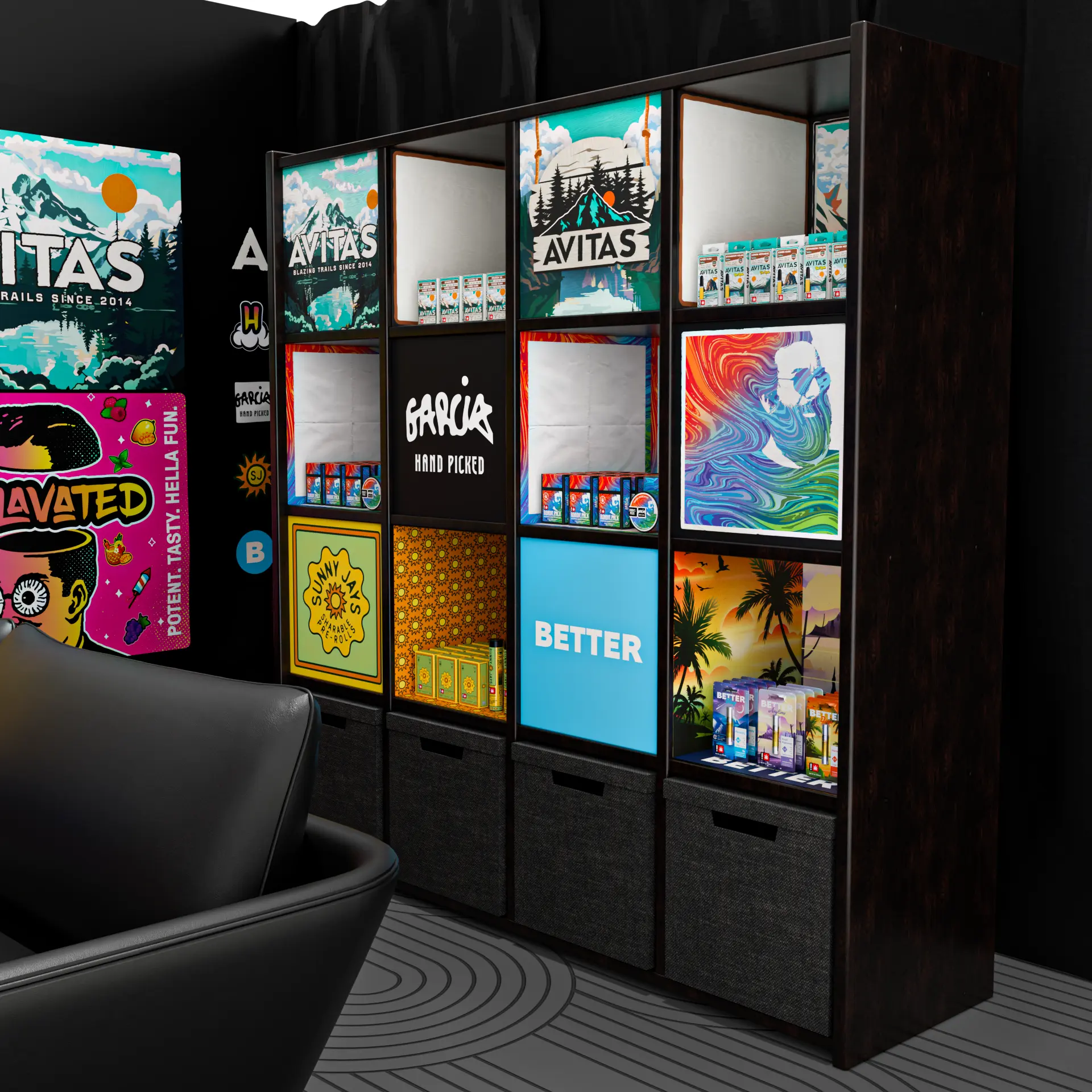
The strongest concepts do not merely enlarge a package. They identify which parts of the identity can become architecture, which details guide navigation, and where restraint allows the product to remain the focus.
ENCORE / THE RESULT
THE MAGIC
WAS IN THE TRANSLATION.
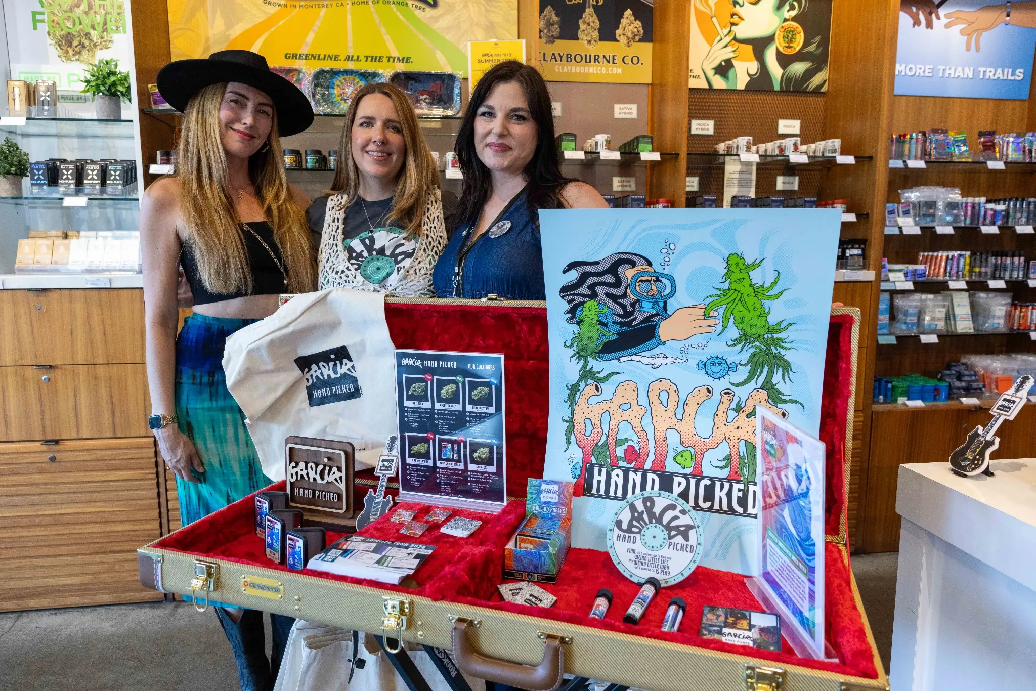
The brand was already established. The task was to make each new expression feel as though it had always belonged. Across packaging, campaign work, photography, and dimensional retail concepts, the project demonstrates what thoughtful stewardship can do: preserve the soul, solve the practical problem, and give an established voice new places to be heard.