Spring
Bright fruit and electric color break through the darkness.
Brand evolution · Packaging · Product · Retail
From street grit to flavor in orbit.
Hellavated is a flavor-first cannabis brand with a rebellious streak. Its original identity was raw by design: dark palettes, distressed texture, urban graphics, and a touch of punk.
As the product range grew, the brand needed a broader visual language, one that could carry more formats and flavors without sanding down its edge.
High-contrast color, distressed marks, irreverent illustration, and a little visual noise gave the early system its unmistakable street-level force.
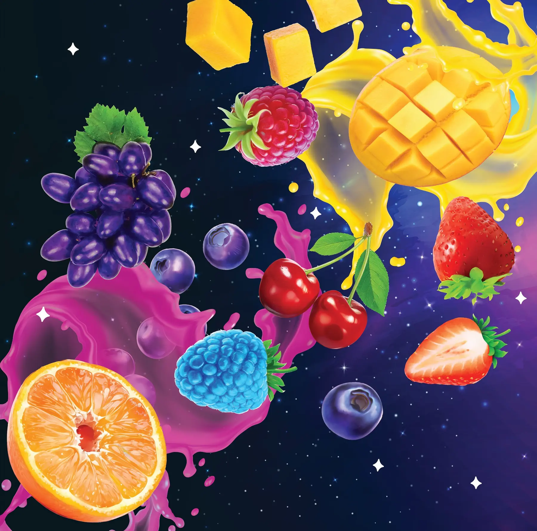
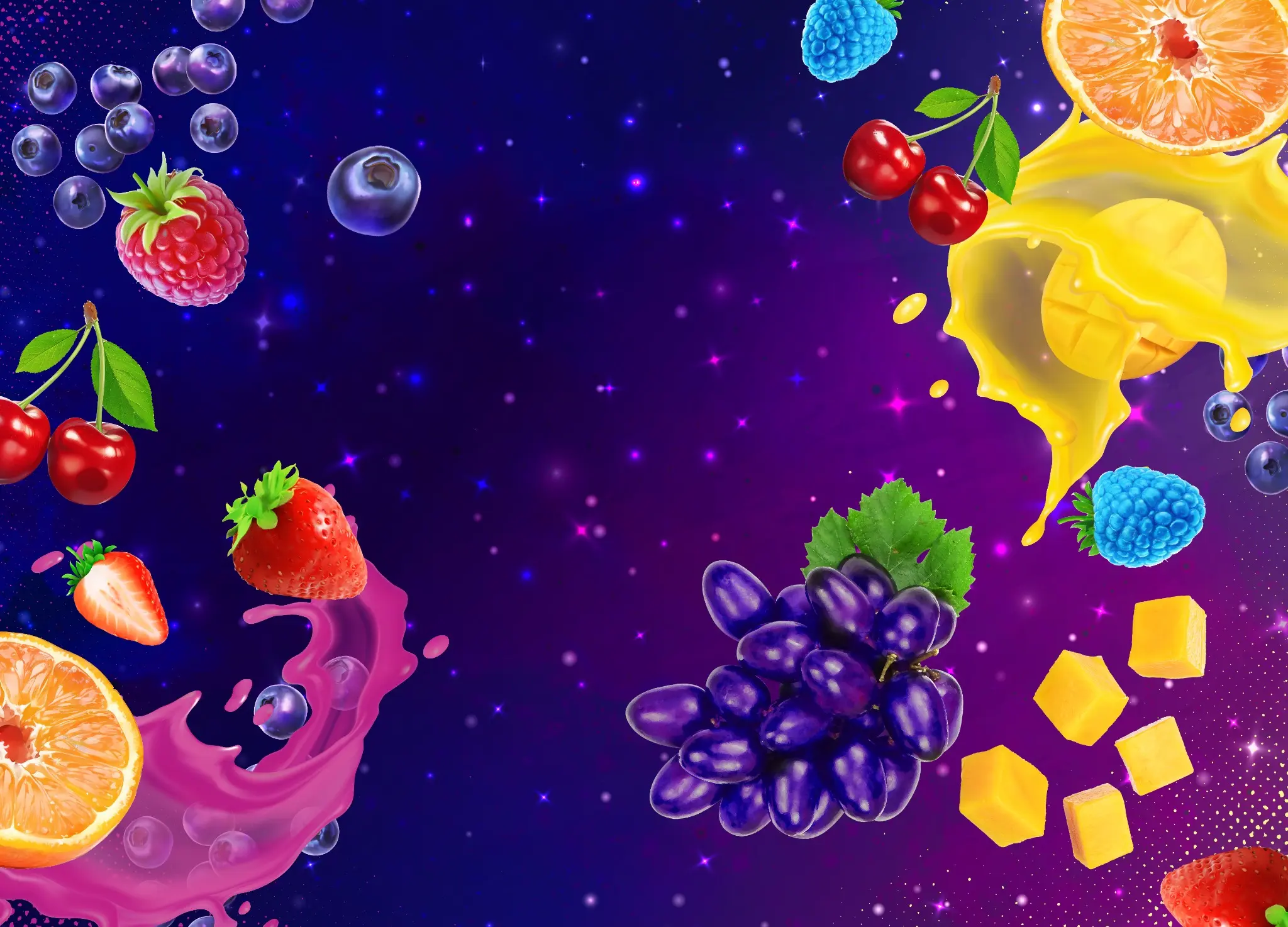
Saturated galaxies opened the world. Oversized fruit made flavor immediate. Glossy splashes added motion. Brighter color gave every SKU a clear point of recognition.
Fruit tells you what to expect. Color makes it easy to find again. Cosmic artwork ties the range together across products and formats.
The system can move from blueberry cool to citrus heat without losing the logo, attitude, or shelf presence that makes Hellavated recognizable.
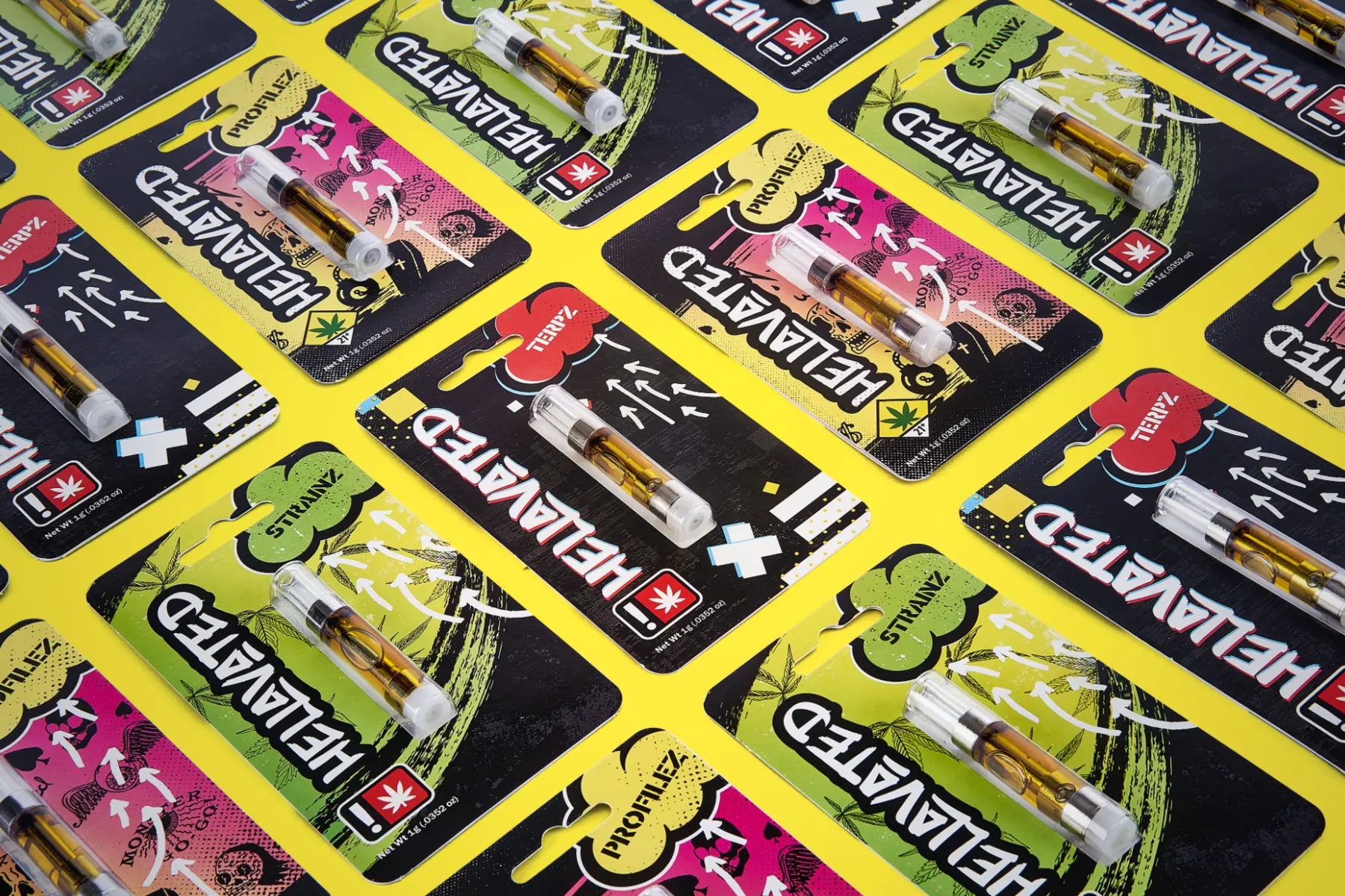
Across vape, gummies, concentrates, and infused pre-rolls, the hierarchy stays quick to read: brand first, format second, flavor impossible to miss.
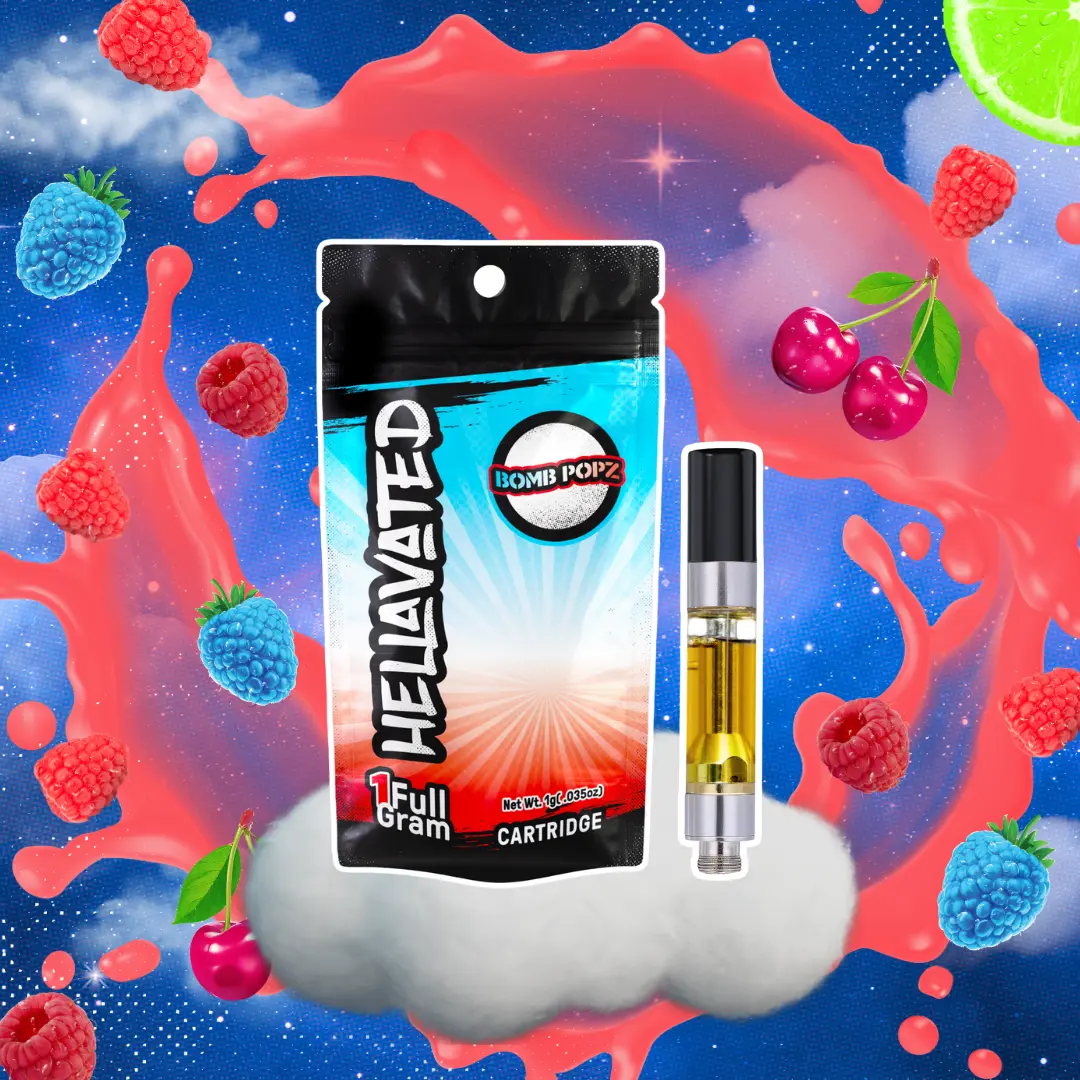
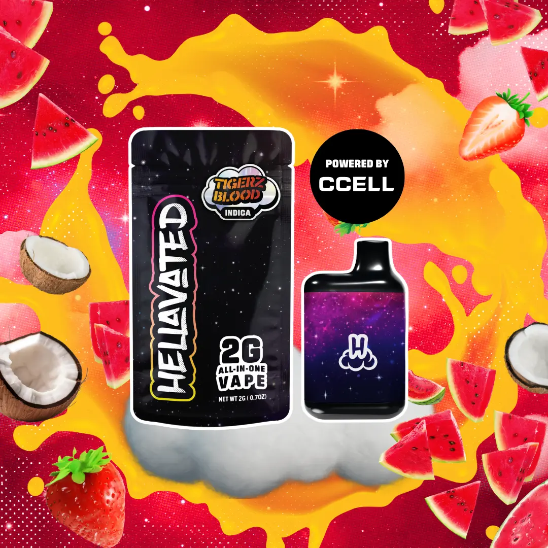
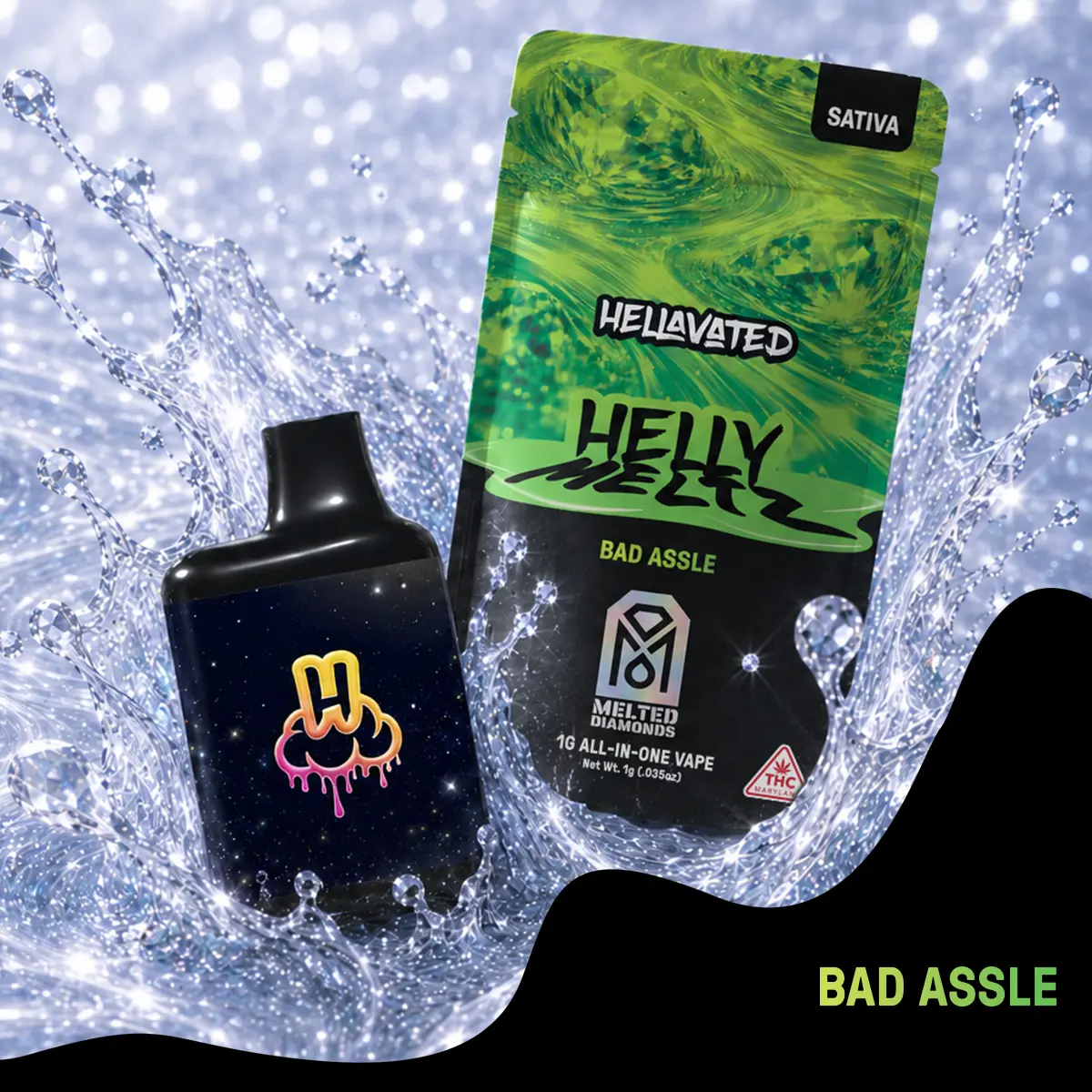
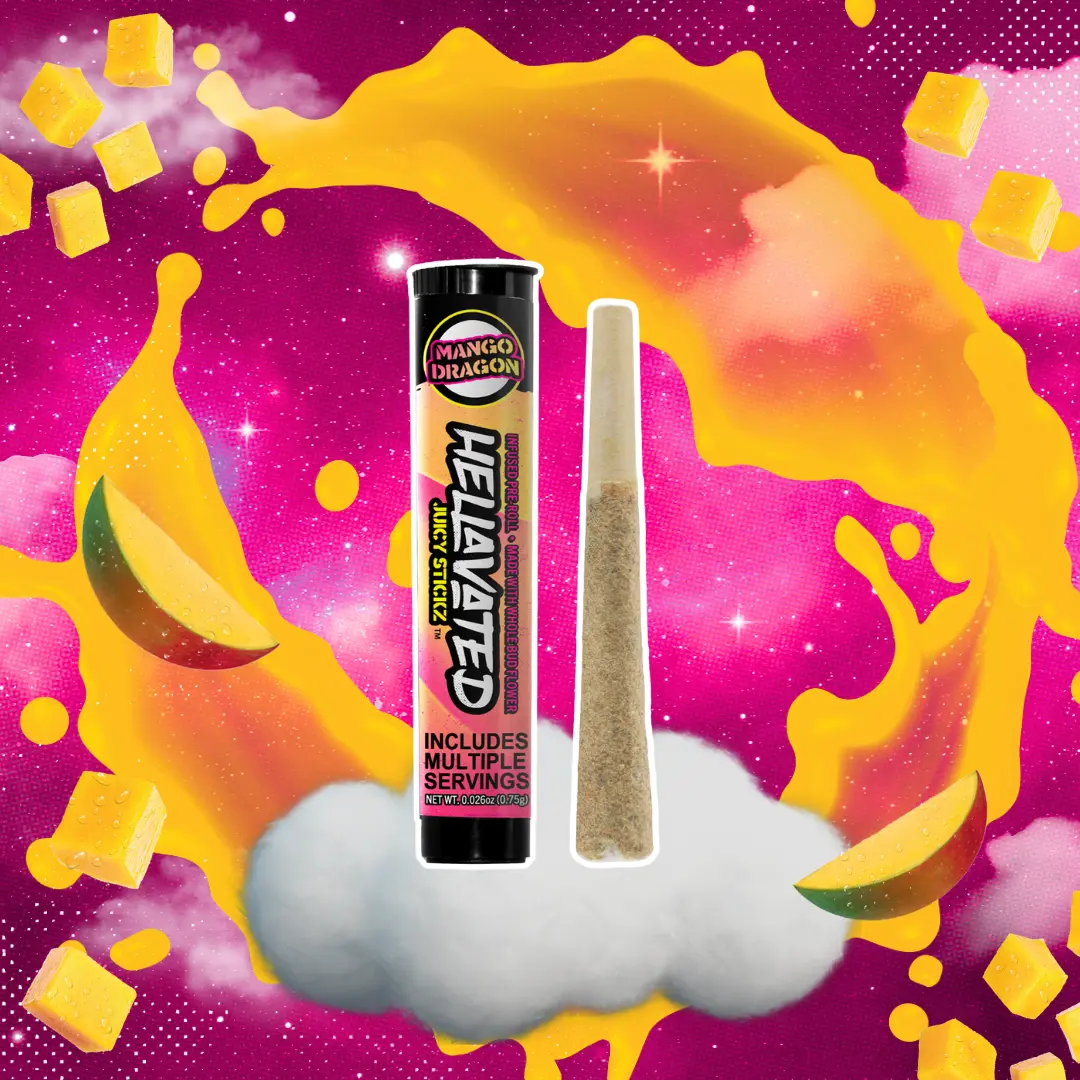
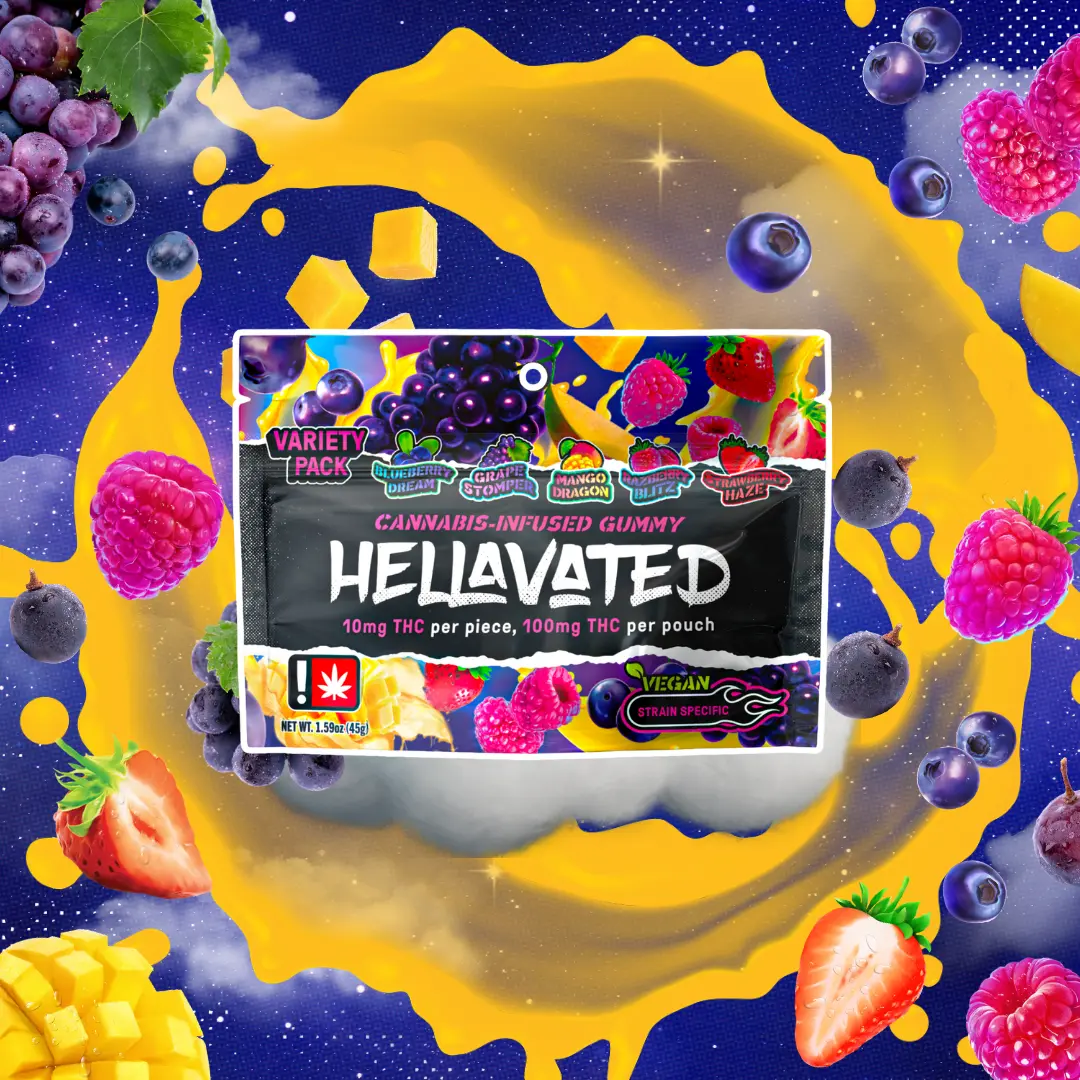
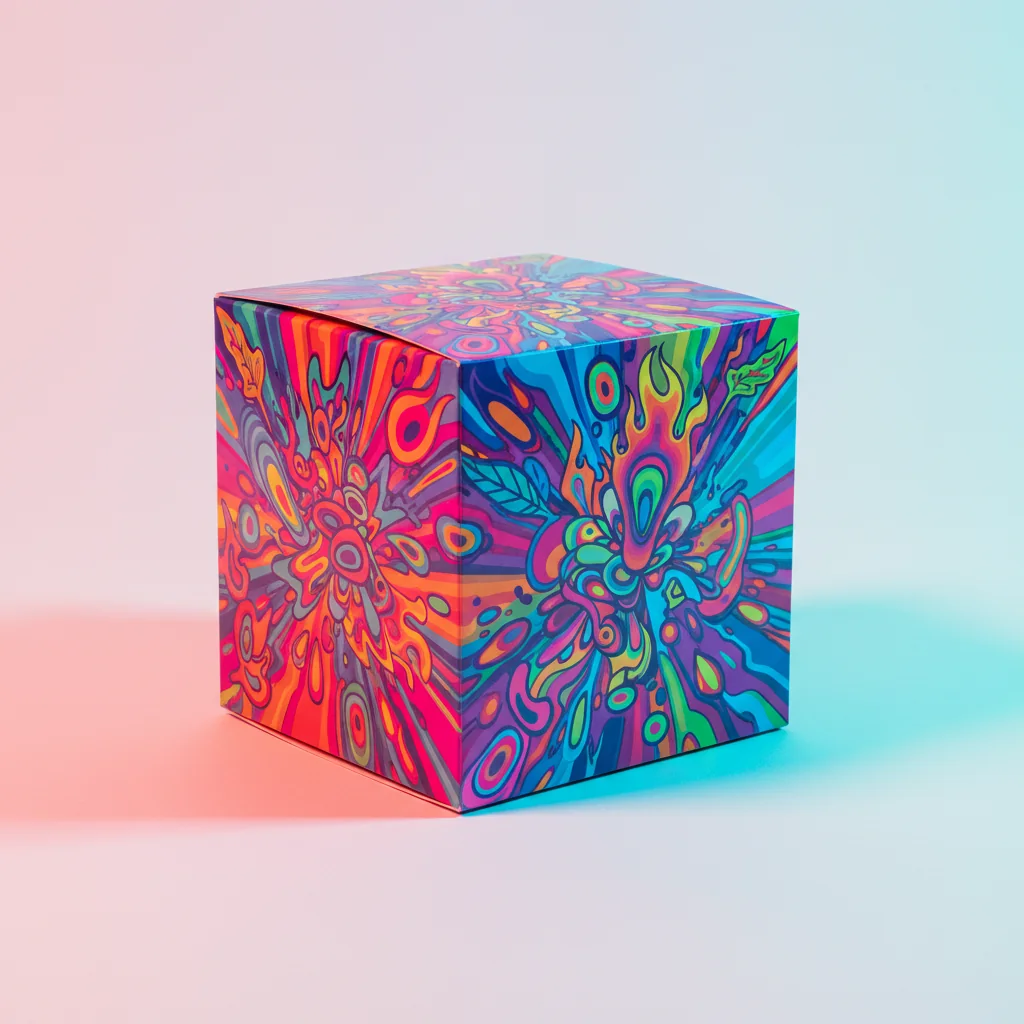
The device was treated as part of the identity, not anonymous hardware. Color, finish, logo placement, and flavor cues carry the packaging story onto the product itself.
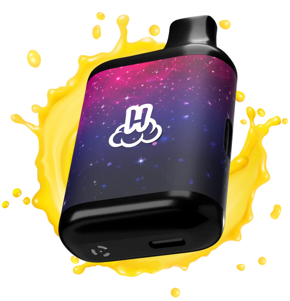
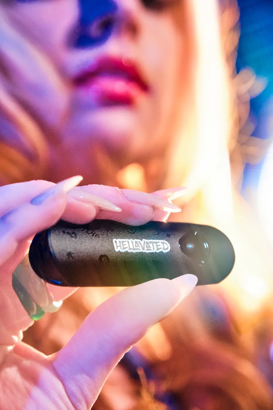
The design language stretches beyond vape without losing force. Fruit, cosmic depth, and a consistent information hierarchy keep every product unmistakably part of the same line.
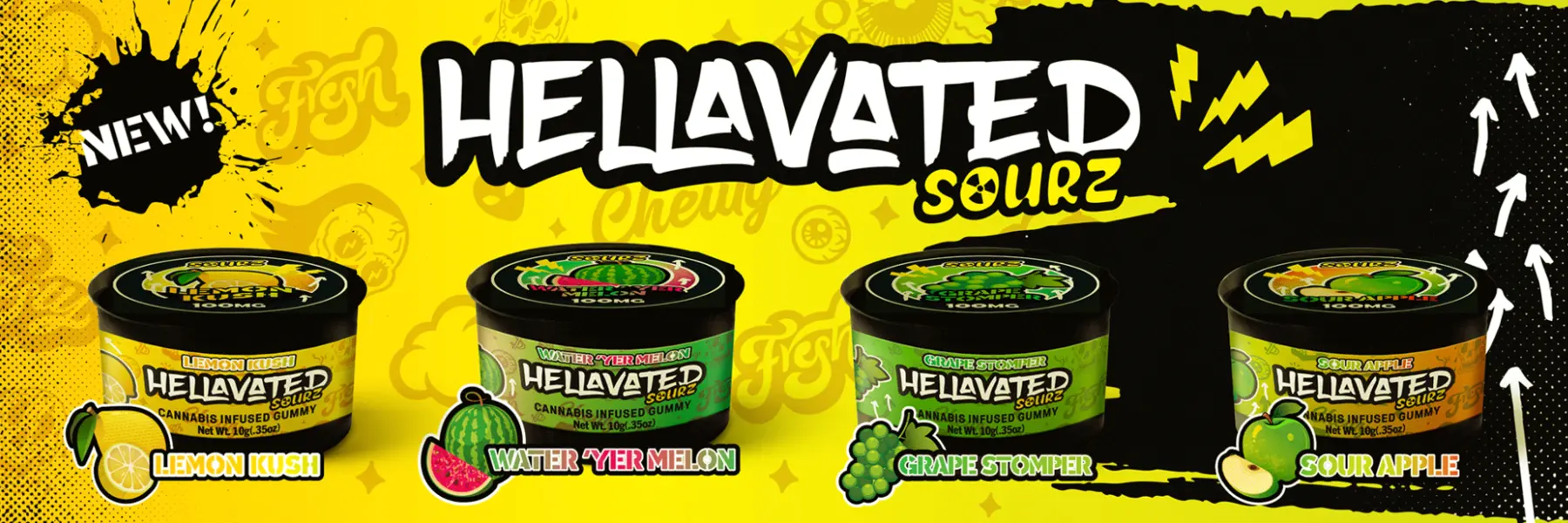
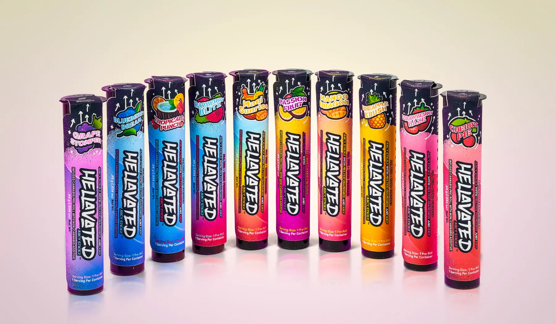
Table tents, posters, and large-format graphics turn individual packs into a full-line statement. The work attracts from a distance, then organizes flavor and format up close.
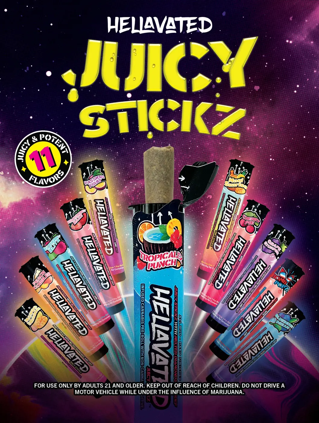
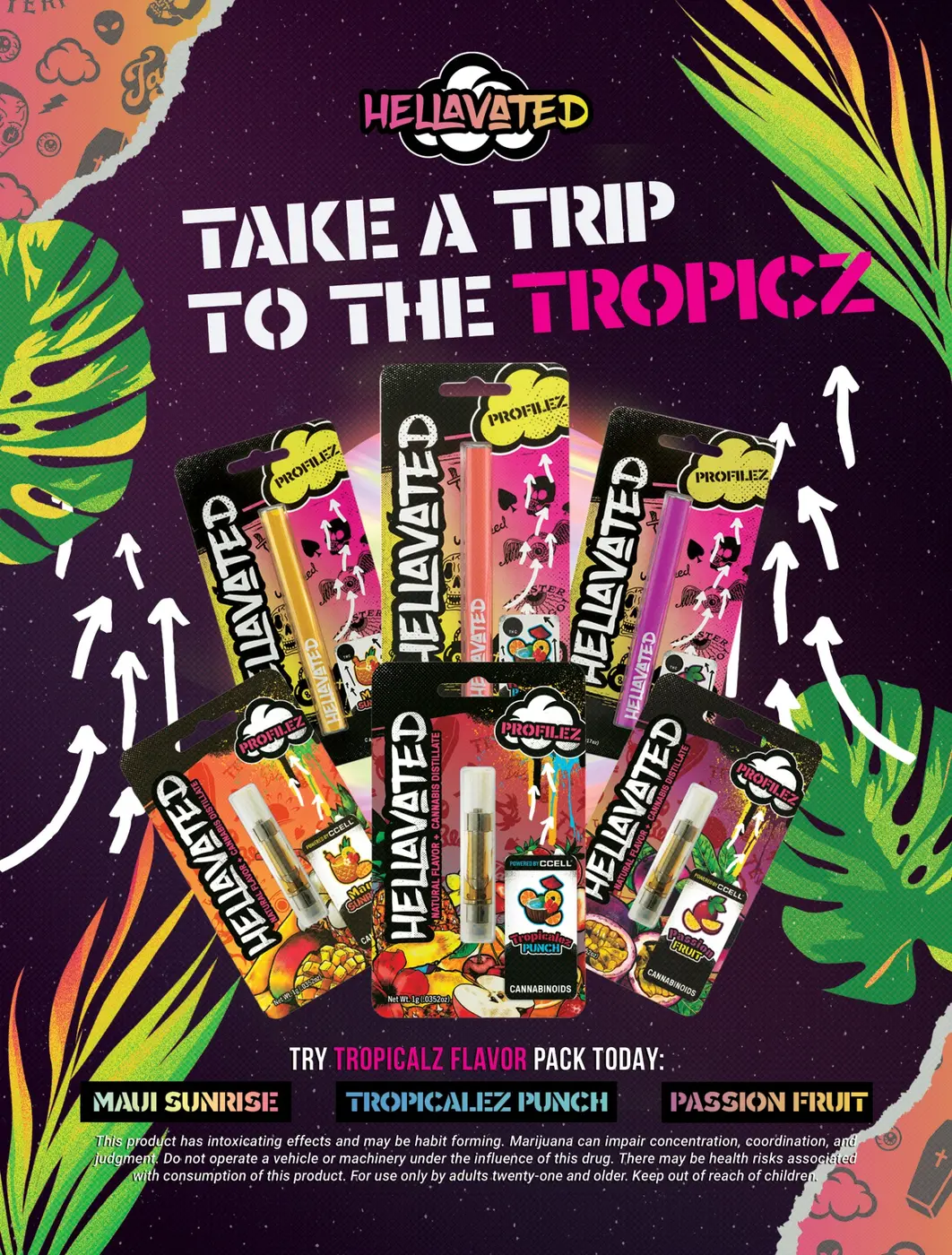
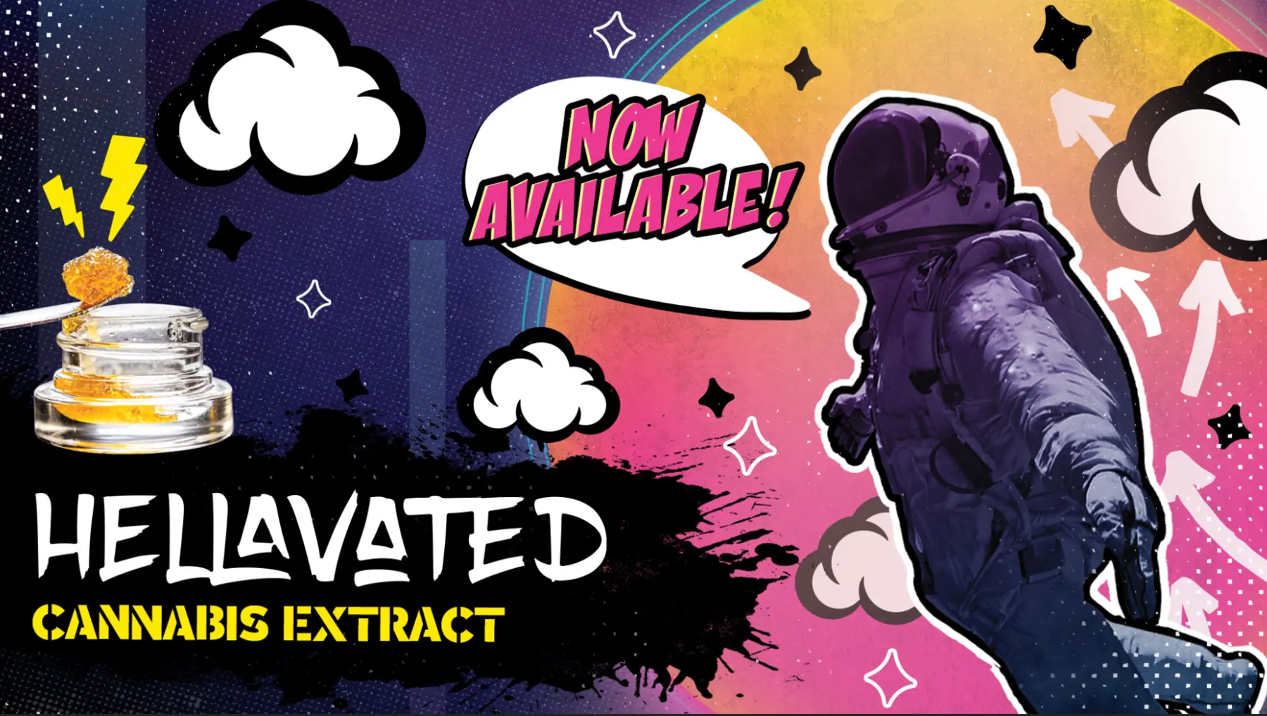
The refreshed graphic system scales from the smallest pack to wall wraps, display environments, exhibition moments, and social content without losing impact.
Colored light, cosmic atmosphere, bold styling, and fruit-forward props move the identity from product promise into lived moment.
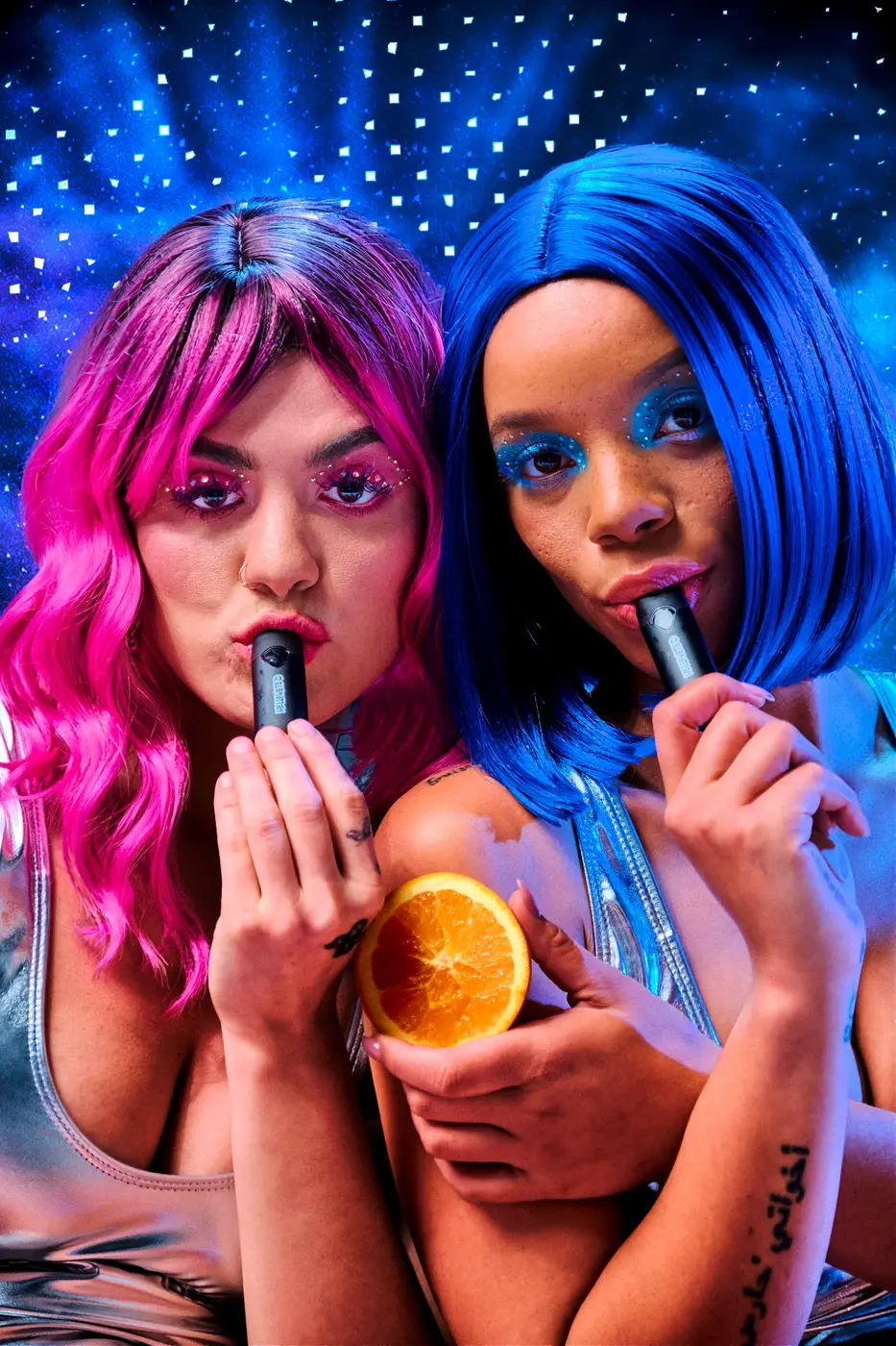
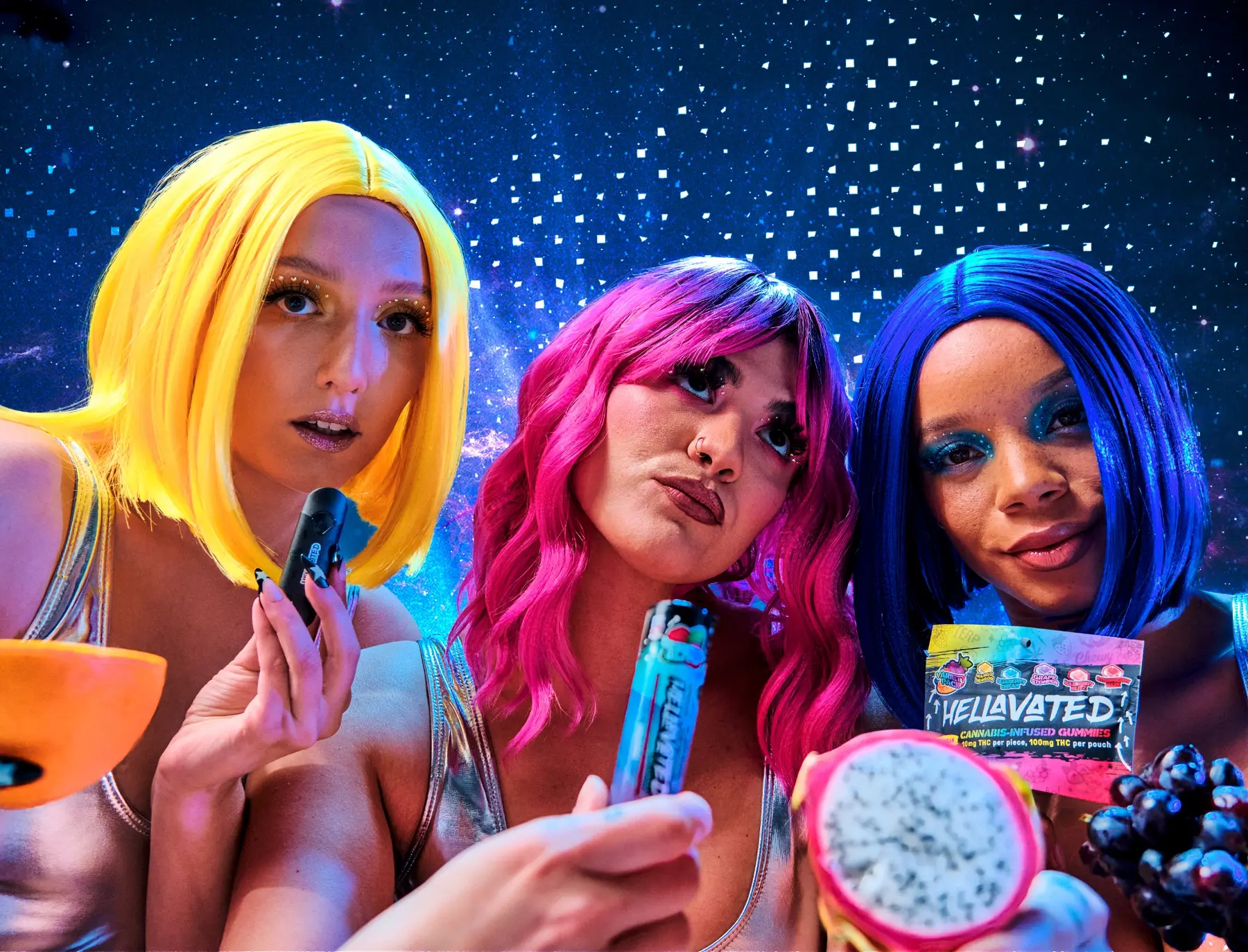
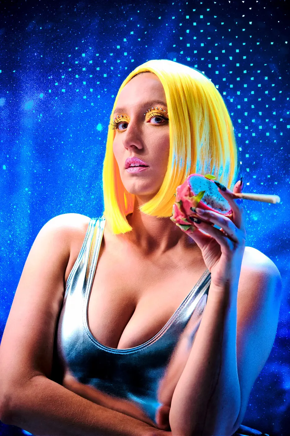
Seasonal drops keep the flavor universe moving. Each release shifts the fruit, color, and atmosphere while the core identity remains unmistakable.
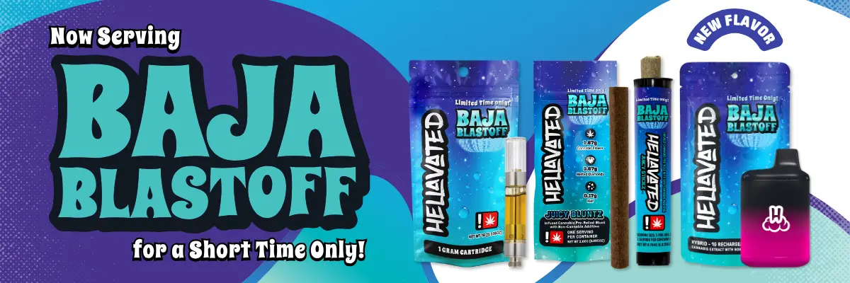
Bright fruit and electric color break through the darkness.
Juicy, saturated, and turned all the way up.
Richer tones pull the collection into a darker orbit.
Icy contrast gives the coldest drop an after-dark glow.
It gave that edge a bigger universe to live in.