





A familiar brand. A louder point of view. Turning Strane's yellow and black
into an unapologetic punk statement.
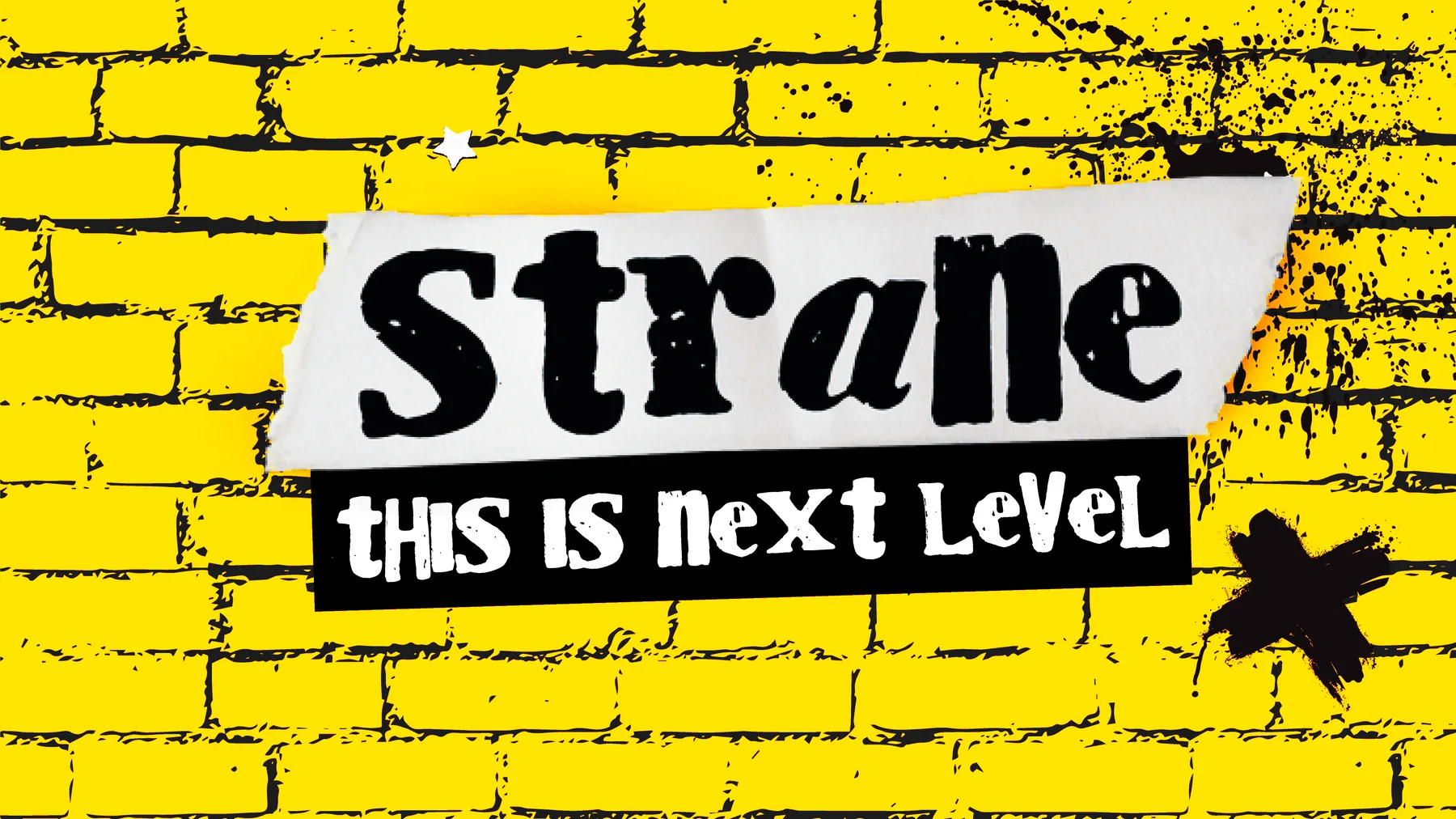
STRANE ✳ THIS IS NEXT LEVEL ✳ UNAPOLOGETICALLY LOUD ✳ STRANE ✳ THIS IS NEXT LEVEL ✳ UNAPOLOGETICALLY LOUD ✳ STRANE ✳ THIS IS NEXT LEVEL ✳ UNAPOLOGETICALLY LOUD ✳ STRANE ✳ THIS IS NEXT LEVEL ✳ UNAPOLOGETICALLY LOUD ✳ STRANE ✳ THIS IS NEXT LEVEL ✳ UNAPOLOGETICALLY LOUD ✳ STRANE ✳ THIS IS NEXT LEVEL ✳ UNAPOLOGETICALLY LOUD ✳
The starting point
Same roots. New attitude.
Strane already had a recognizable foundation: yellow, black, and three expressive
eyecons. The rebrand kept those familiar cues and gave them a rawer, more
confrontational presence.
THE LEGACY IDENTITYYellow / Black / EyeconsThe original packaging system
Working with Holistic Industries' marketing team, we developed a bold punk direction
designed to stand out on the shelf and look unmistakably Strane at a glance.
The new identity
Turn up the attitude.
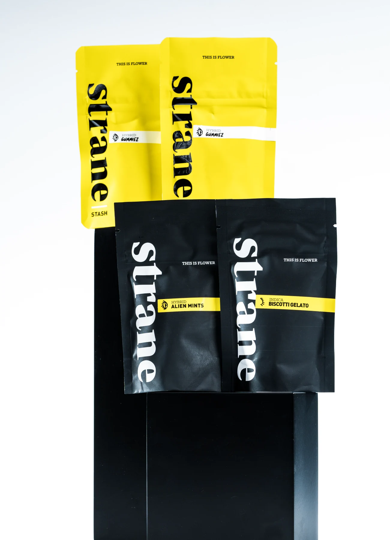
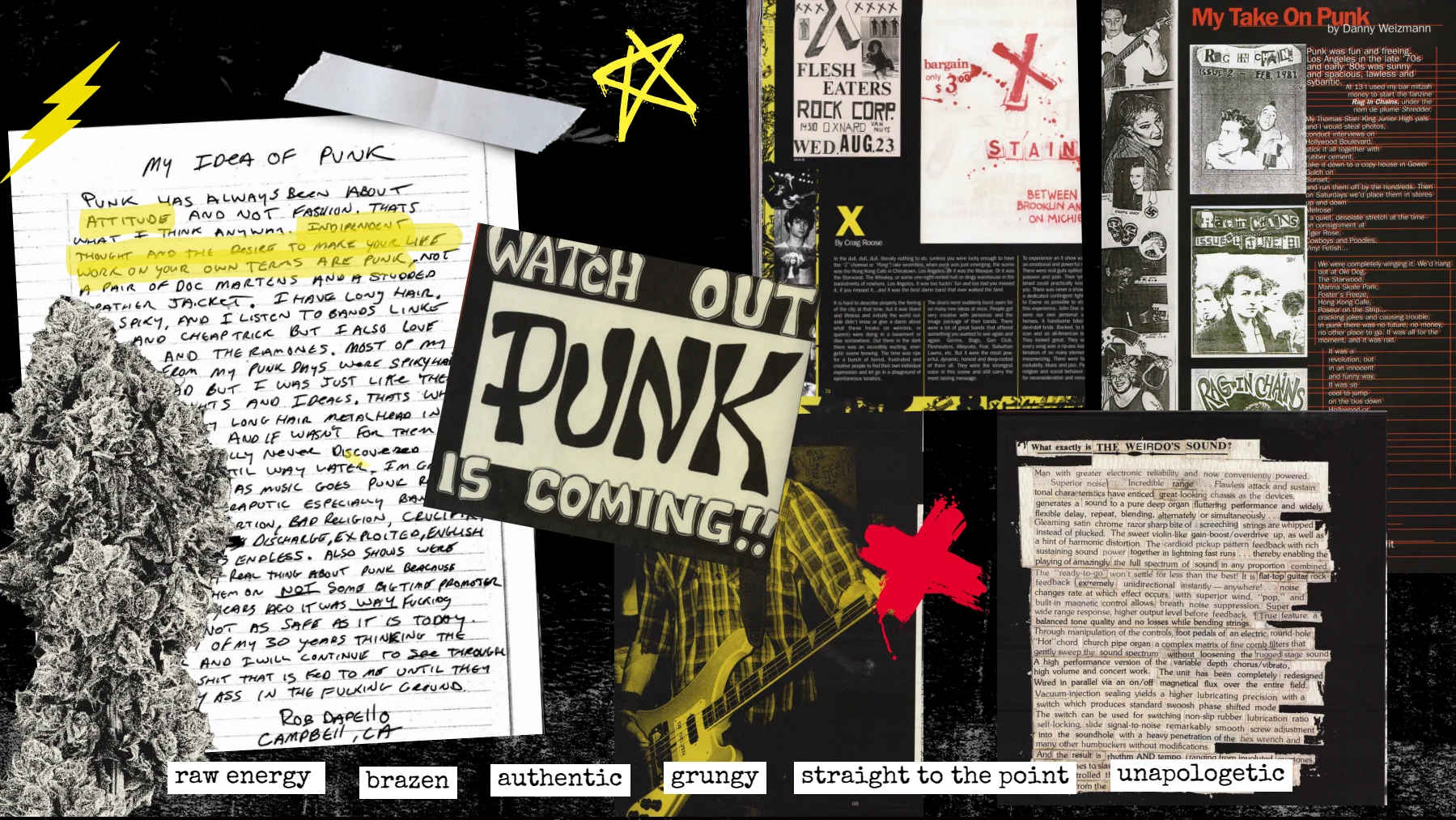
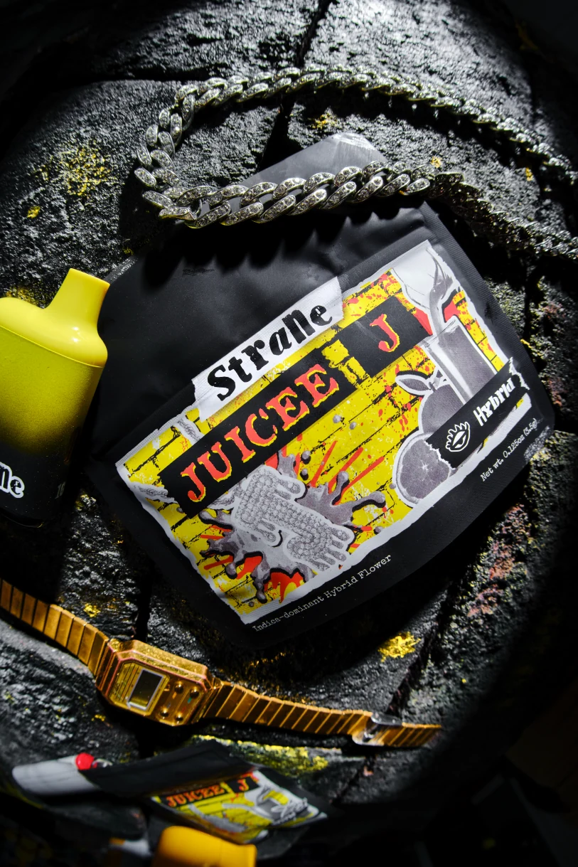
PANTONE 3955 C yellow leads the charge. Black bags, yellow brick, wheat-paste layers,
ripped edges, and halftone imagery bring the energy of a punk collage to the brand.
PUNK REFERENCES / CREATIVE DIRECTION
The graphic language
Rip it. Paste it. Make it Strane.
Distressed type and halftone cutouts sit against yellow brick. Wheat-paste layers
bring a rough, handmade quality to the surface, while the black bag holds everything
together.
Brick / Paper / Collage graphics / Distressed texture
The color you spot firstThat yellow.
PANTONE 3955 C
A striking point of recognition across packaging, merchandise, and the retail
environment.
Digital color shown as a screen approximation.
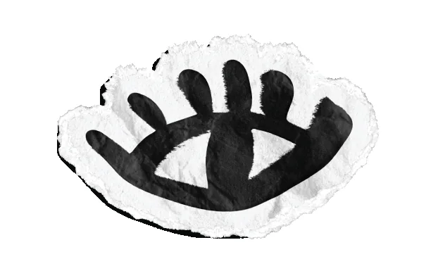
Meet the eyecons
Three eyes. All Strane.
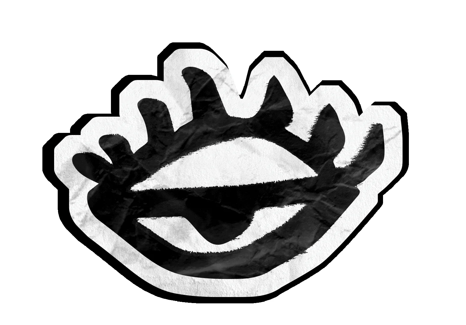
The rebrand carries forward the three familiar eyecons. Each expression identifies a
product type, keeping a recognizable part of Strane at the heart of the new look.
01 / EYECON
Hybrid
Half open
02 / EYECON
Indica
Closed
03 / EYECON
Sativa
Wide open
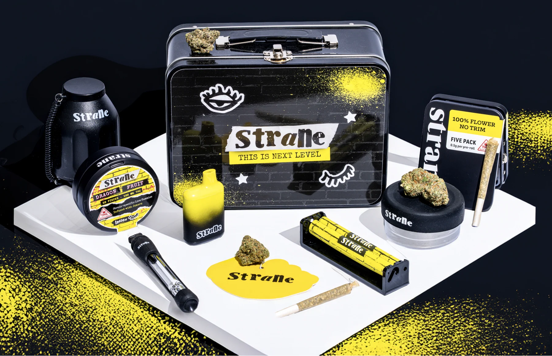
Packaging
Built for the shelf.
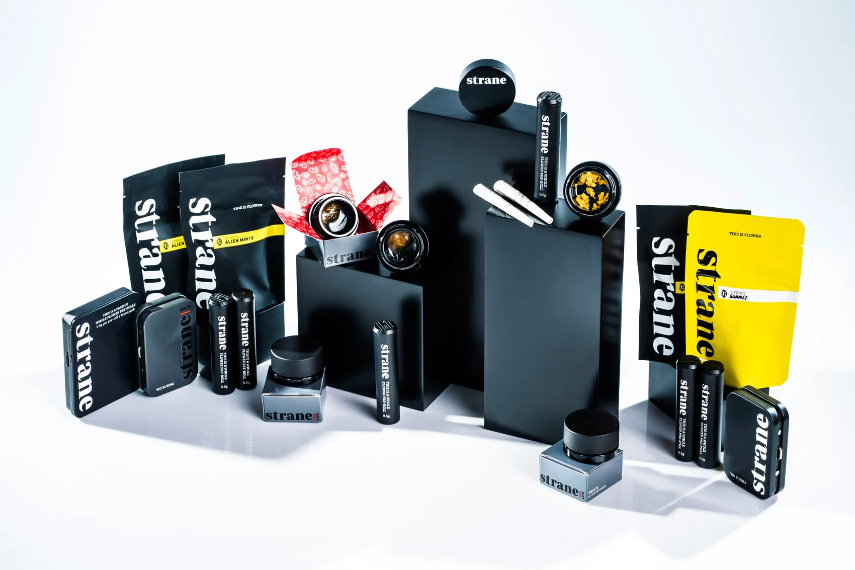
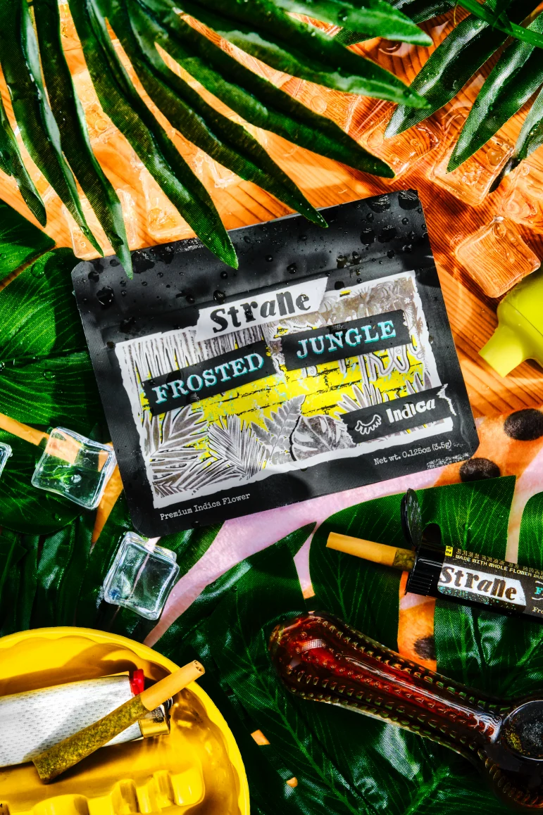
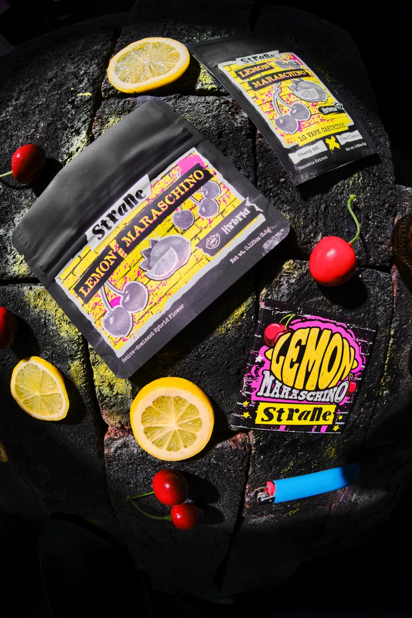
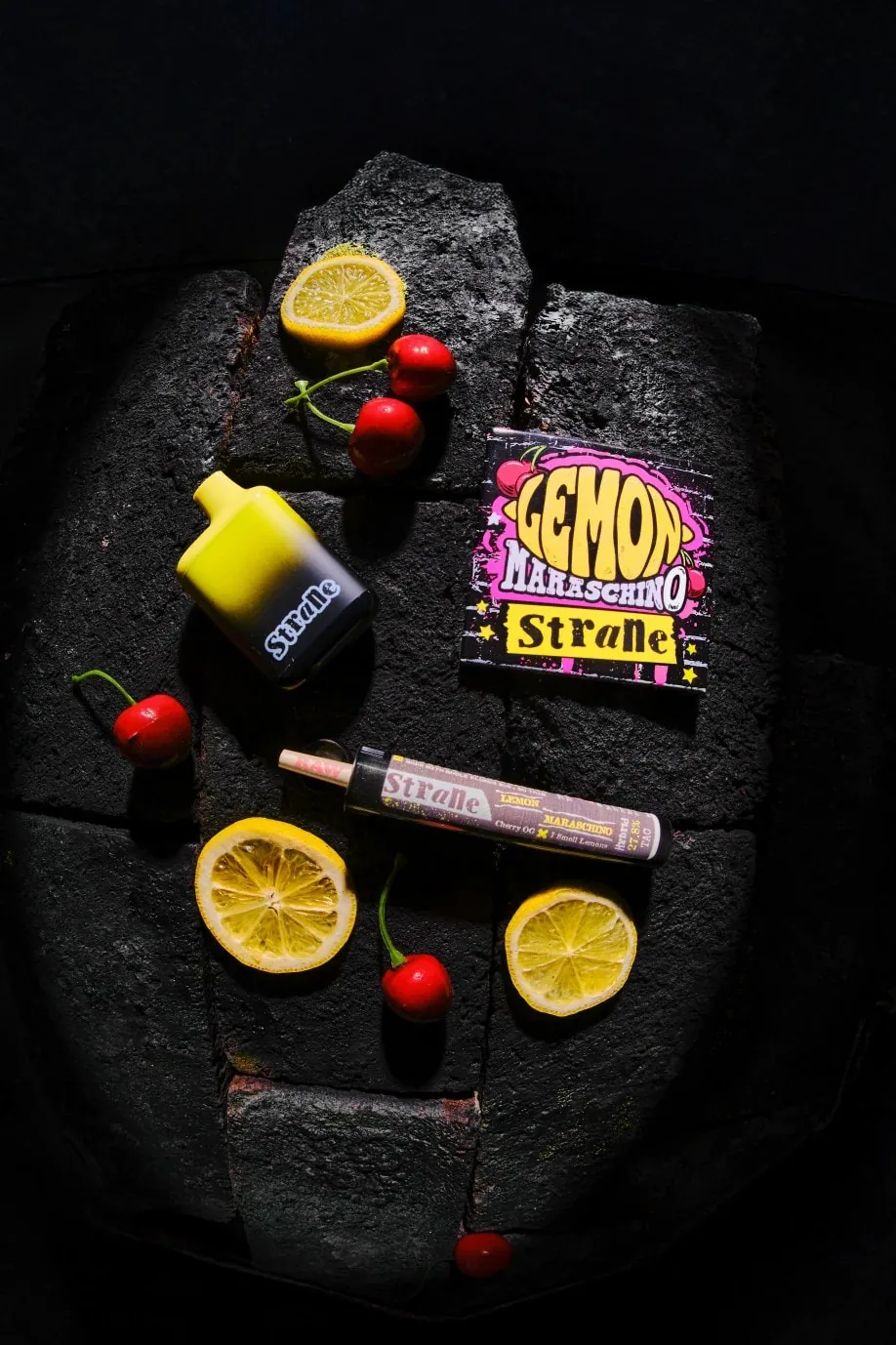
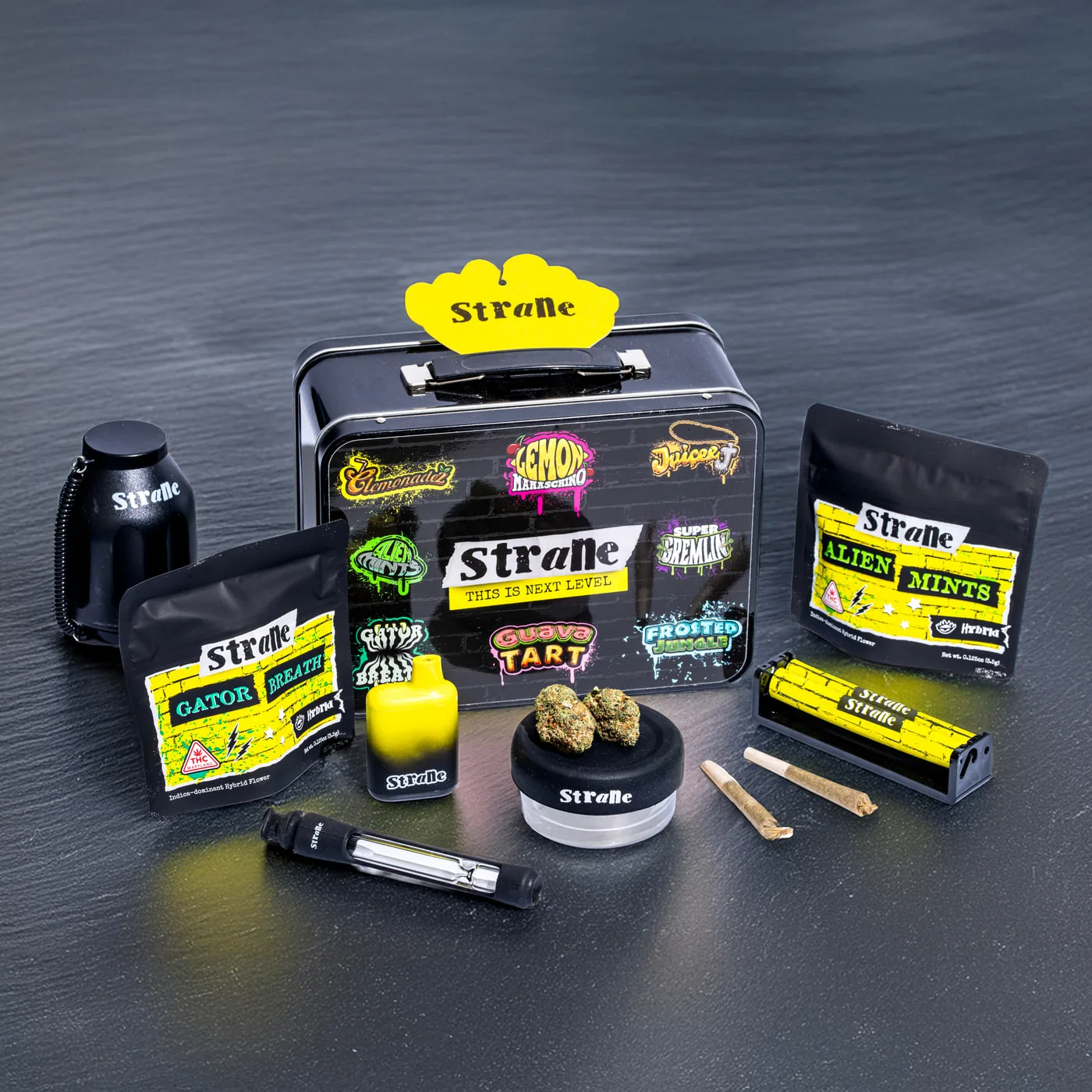
The same yellow-and-black framework connects flower, vapes, pre-rolls, and gummies,
while each strain gets its own cut-and-paste personality.
ACROSS FORMATS / A connected strain identity
One recognizable family
Different forms. Same volume.
Flower pouches, vape packaging, pre-rolls, and gummies share the same graphic
ingredients. The layouts adapt to each format without losing the yellow, the
attitude, or the eyecons.
OFF THE SHELF ✳ INTO THE WORLD ✳ OFF THE SHELF ✳ INTO THE WORLD ✳ OFF THE SHELF ✳ INTO THE WORLD ✳ OFF THE SHELF ✳ INTO THE WORLD ✳ OFF THE SHELF ✳ INTO THE WORLD ✳ OFF THE SHELF ✳ INTO THE WORLD ✳
Lifestyle & merchandise
Worn out. Taken out.
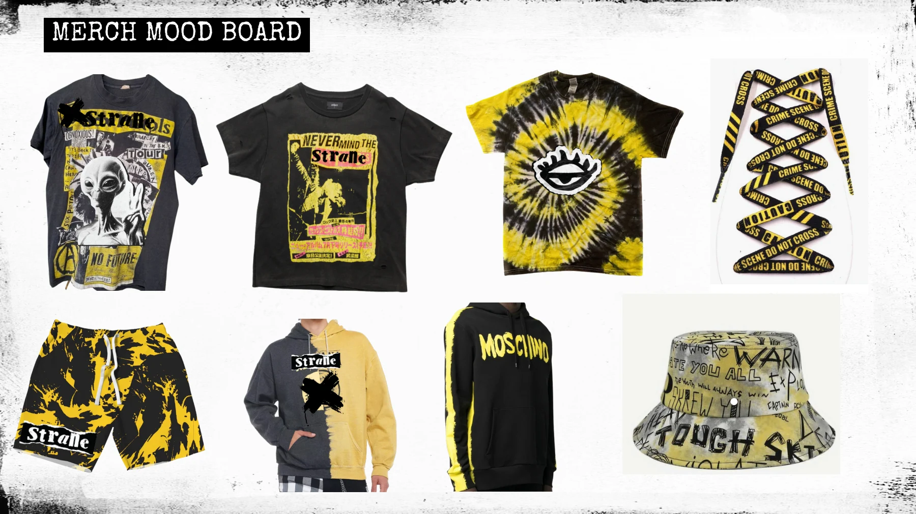
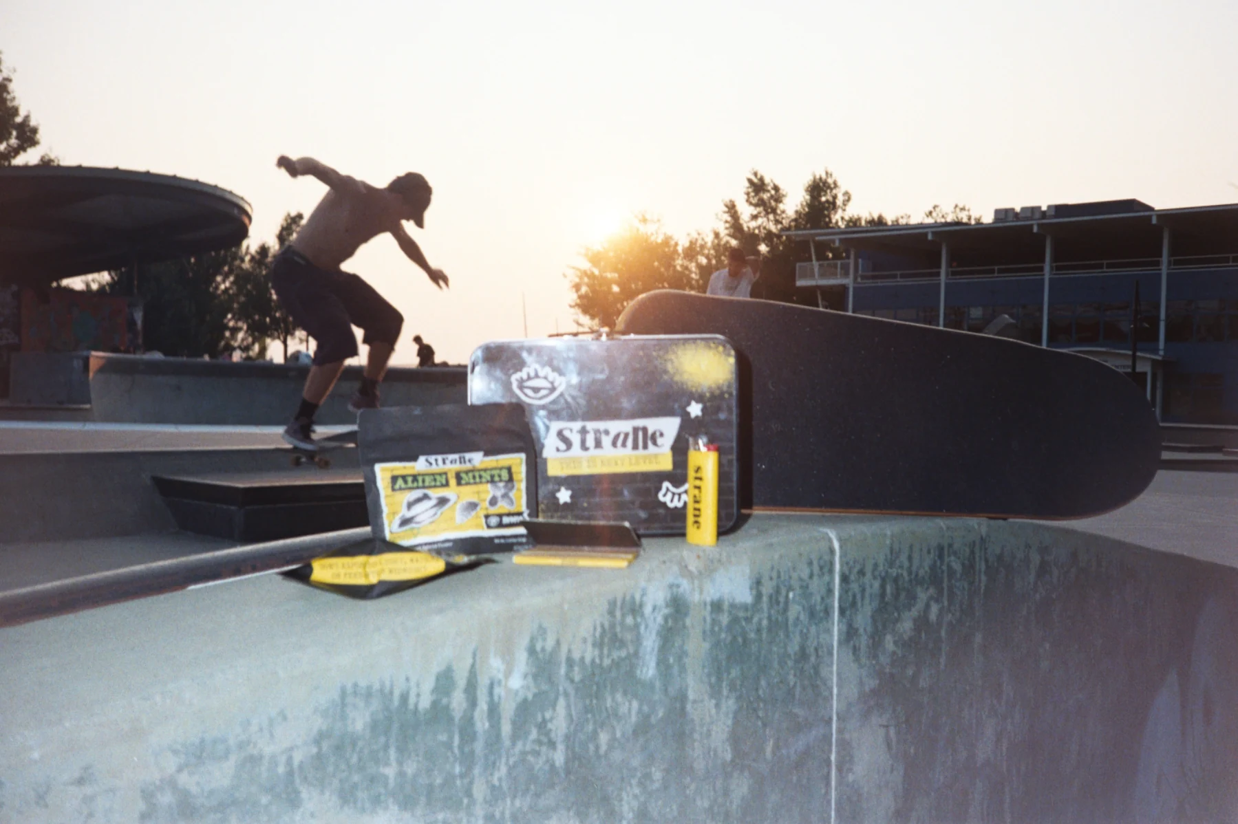
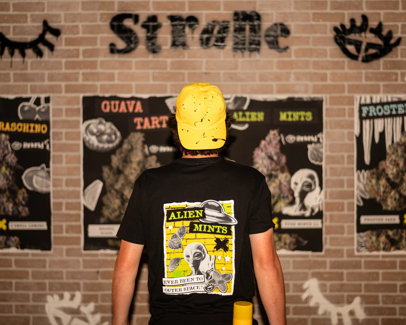
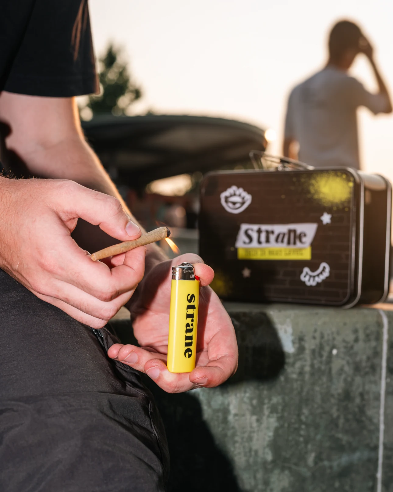
The collage language carries into shirts, accessories, and lifestyle imagery. Away
from the shelf, yellow and black keep the brand visible while the eyecons become
graphics people can wear.
Merch exploration / Mood board
Creative exploration and references; not a released-product lineup.
LIFESTYLE PHOTOGRAPHY / SKATEPARK
The packaging collage becomes a wearable graphicSmall objects carry the same brand cues
Retail activation
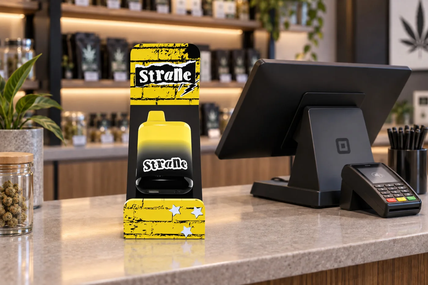
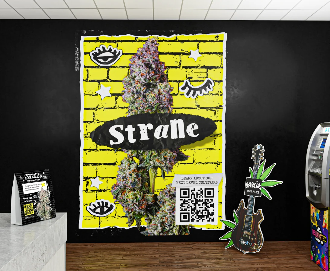
A statement. At every scale.
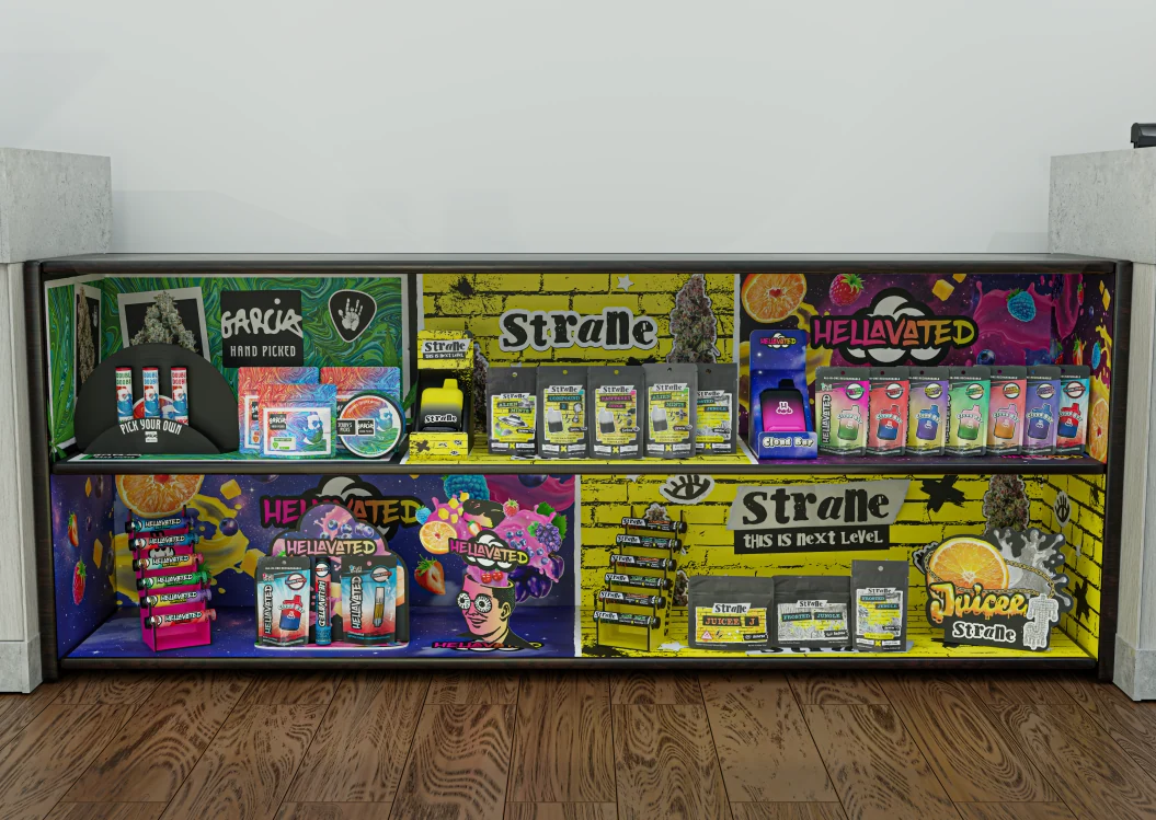
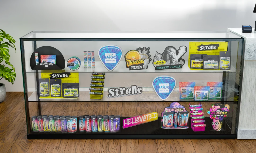
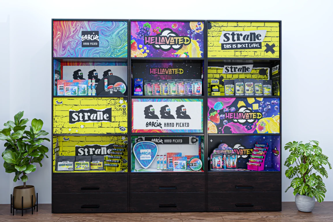
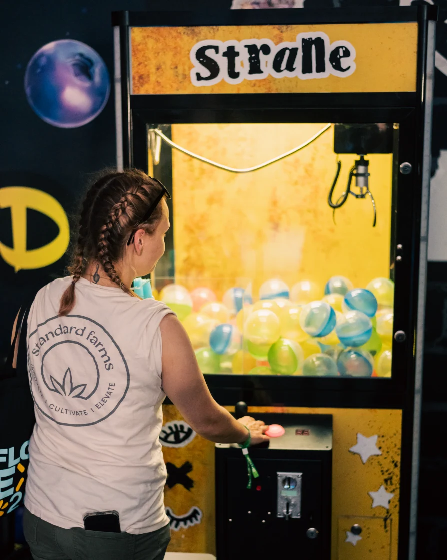
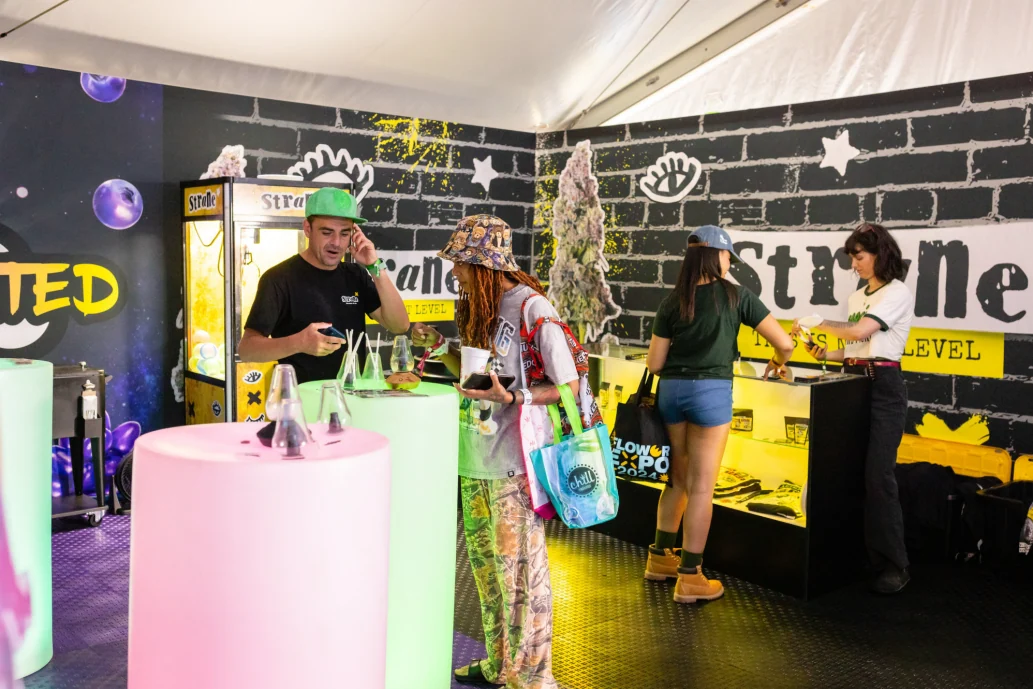
The yellow brick becomes a recognizable backdrop for display stands, cabinets, and
larger retail graphics. The packaging language grows into an environment.
A full-height expression of the brandA full-height expression of the brand
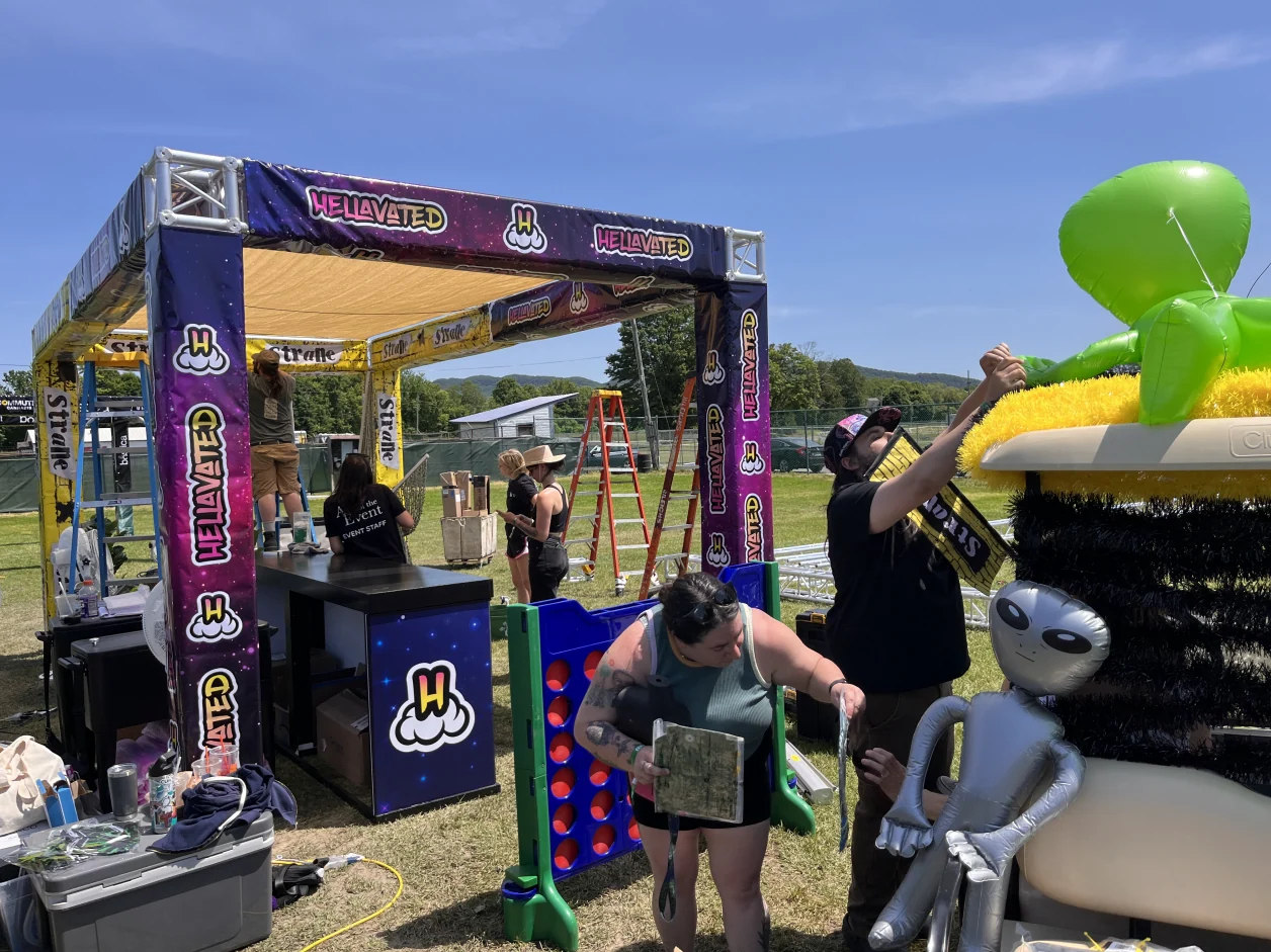
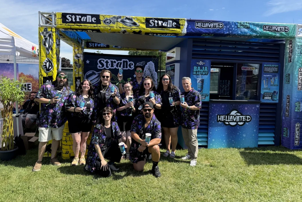
For Flower Expo, we collaborated with Holistic Industries' marketing team on booth
concepts, design, and 3D visualization. The co-branded booth brought the graphics to
life in a shared physical space.
FLOWER EXPO / CO-BRANDED ACTIVATIONBrand graphics meet event interactionThe team behind the activationInside the brand environment
The takeaway
Recognizable at a glance. Unapologetically Strane.
The rebrand gives Strane a louder expression while keeping the elements people
recognize. Yellow, black, and the three eyecons connect a punk collage language across
packaging, merchandise, retail, and events.